Gillyfish Posted December 5, 2007 Share Posted December 5, 2007 Greetings! As many of you know, I have been beavering away on a painting tutorial for some time. I am proud to say that this is the first installment. Before starting there are a few things that I ought to say. Firstly, this painting technique will no suit everyone - it's the style I like, but that doesn't mean anyone else's should be disregarded! Secondly, I'm not the world's best painter; the miniatures here are what I consider to be a good tabletop standard - they won't win Golden Demon! Instead, I hope that this tutorial will inspire existing painters or help new painters realise that it isn't all that hard! Basic Ideas I've always believed Dark Angels should be, well, dark. I remember descriptions of them saying that they had armour so dark that it was almost black and that the green only really showed through where the light caught it. I desperately tried to capture that fell, but could never get to a point where I was totally satisied with the results. There was a picture of a Devastator squad in the second edition codex that fitted the bill perfectly and, as my confidence increased, I began to get closer to achieving what I was after. The technique I use is called extreme highlighting. There's an article on the GW website that explains the principles of this technique, but, basicaly, you are looking to create and effect of the light catching the armour on its raised edges - thi means you need to think a bit about the direction the light coming from before you start painting, as you'll need to work out where the brightest highlights should be (I confess that I haven't quite perfected that yet!). I find that one of the things that makes this technique so striking is the contrast between shades - from very dark, to quite bright. Some of my earlier miniatures weren't sufficiently dark for the contrast to show (not that there was anything wrong with that, but it wasn't what I was after!). Stage 1: Painting the green. Undercoat your models in Chaos Black (spray paint is fine). They should look something like this: http://i119.photobucket.com/albums/o126/Gillyfish2010/Photo1.jpg Then paint them Dark Angel Green. Ensure that it's fairly thin so you get even coverage. It's best not to spray this colour as it will make the ink we apply later patchy. The miniatures should look like this: http://i119.photobucket.com/albums/o126/Gillyfish2010/Photo2.jpg Then cover the miniature in neat black ink; you should end up with very dark, quite shiny armour. http://i119.photobucket.com/albums/o126/Gillyfish2010/Photo3.jpg You'll then want to apply your first highlight of dark angel green around the edges of each piece of armour - these can be fairly broad, but try to leave a good portion of shiny inked-green showing. Again, keep the paint quite thin so it flows well. http://i119.photobucket.com/albums/o126/Gillyfish2010/Photo4.jpg Now the hard, time-consuming part. Using snot green, paint the edges of the armour. Take your time, it's worth getting this right, but don't be worried if you make mistakes as you can cover them up later. The miniature may look a little rubbish at this stage, but don't be alarmed! http://i119.photobucket.com/albums/o126/Gillyfish2010/Photo5.jpg Then paint thin edges of Goblin Green on the areas of the armour where you want the light to fall most strongly. Don't go overboard here - you're trying to make it seem as if the transition between the highlights is gradual. I've included two pictures for reference. http://i119.photobucket.com/albums/o126/Gillyfish2010/Photo6.jpg http://i119.photobucket.com/albums/o126/Gillyfish2010/Photo7.jpg That's all for now. I'll try to post up some more soon. Link to comment https://bolterandchainsword.com/topic/124707-dark-angel-painting-tutorial/ Share on other sites More sharing options...
HJL Posted December 5, 2007 Share Posted December 5, 2007 gosh, there very bright arent they. Link to comment https://bolterandchainsword.com/topic/124707-dark-angel-painting-tutorial/#findComment-1434842 Share on other sites More sharing options...
Onisuzume Posted December 5, 2007 Share Posted December 5, 2007 Aww!! My eyes! Way too bright for the highlights. We're Dark Angels, not Neon Marines. Link to comment https://bolterandchainsword.com/topic/124707-dark-angel-painting-tutorial/#findComment-1434844 Share on other sites More sharing options...
Nirraven Posted December 5, 2007 Share Posted December 5, 2007 Sorry, I´am more e reader than a poster, but as a longtime DarkAngel player I think I have to comment this. Are you going to cover them with Dark Green Ink? To smoothen the highlights? It seem too harsh this way (up until now) Link to comment https://bolterandchainsword.com/topic/124707-dark-angel-painting-tutorial/#findComment-1434880 Share on other sites More sharing options...
Gillyfish Posted December 5, 2007 Author Share Posted December 5, 2007 ;) Remember I said they looked terrible, but to stick with it? They are very bright to begin with for two reasons - one I'm using a flash and the colours come out pretty starkly that way. Two - there's no other colour on the miniature so the eye is drawn to them. Check out the link below where one of the minis has a bit more colour and you'll see what I mean. http://i119.photobucket.com/albums/o126/Gi...10/P1010088.jpg Link to comment https://bolterandchainsword.com/topic/124707-dark-angel-painting-tutorial/#findComment-1434911 Share on other sites More sharing options...
Chaplain Lucifer Posted December 5, 2007 Share Posted December 5, 2007 You are indeed right. With more colour the extreme highlights won't look so extreme. Thanks for sharing the tips1 ;) Link to comment https://bolterandchainsword.com/topic/124707-dark-angel-painting-tutorial/#findComment-1434930 Share on other sites More sharing options...
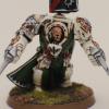
exsulis81 Posted December 6, 2007 Share Posted December 6, 2007 The mini in the photo bucket picture does indeed look awesome. I think part of the difference is the lighting, distance from the camera, and background hues which off-sets some of the highlights that we are seeing in the wip. But the photobucket mini does have more colors to change the perception of the extreme highlighting. I do concur with Nirraven that the WIP looks a little bright but it is just that. Keep going until you're finished, and if you like it on your test minis then paint the rest that way. :) If you end up being too bright, you could always do as Nirraven suggested, and do a diluted green/black(2p g, 1p b, 5p water) wash to subdue some of the solar flaresk edging. The legs on that PF model are the fantasy chaos warriors? Link to comment https://bolterandchainsword.com/topic/124707-dark-angel-painting-tutorial/#findComment-1435166 Share on other sites More sharing options...
Gillyfish Posted December 6, 2007 Author Share Posted December 6, 2007 Thanks Exsulis - actually the sergeant was painted int he same batch as the guys in the tutorial (they have now all been finished). The sergeant does indeed bear the legs of a Chaos Warrior - I used Doghouse's tutorial in the P,C&A section to create him. The shot below shows some of the minis above at a later stage (although still not finished) - does that help allay fears? http://i119.photobucket.com/albums/o126/Gi...10/DSCF0189.jpg Link to comment https://bolterandchainsword.com/topic/124707-dark-angel-painting-tutorial/#findComment-1435325 Share on other sites More sharing options...
Ronin_eX Posted December 6, 2007 Share Posted December 6, 2007 Looks really good and actually makes them look darker while still letting you know they're green. Certainly a cool style, unfortunately it is a little late to re-re-paint my stuff now so I wont get much of a chance to test it out. A very cool technique for painting very dark colours while still getting definition. Link to comment https://bolterandchainsword.com/topic/124707-dark-angel-painting-tutorial/#findComment-1435367 Share on other sites More sharing options...
Isiah Posted December 6, 2007 Share Posted December 6, 2007 Nice start Gilly – looking forwards to the next installments. Cheers I Link to comment https://bolterandchainsword.com/topic/124707-dark-angel-painting-tutorial/#findComment-1435405 Share on other sites More sharing options...
The Fabricator General Posted December 6, 2007 Share Posted December 6, 2007 I like what you're trying to portray here Gilly and I reckon the technique you've come up with is a good one. However I think you could improve it greatly by using smaller highlights cause at the moment I think theres too much of the lightest colour. Link to comment https://bolterandchainsword.com/topic/124707-dark-angel-painting-tutorial/#findComment-1435414 Share on other sites More sharing options...
Nirraven Posted December 6, 2007 Share Posted December 6, 2007 The more progressed models and the model on Photobucket look nice. The highlights no longer distract from the Mini itself. I have to admit that I may have judged a bit too early on the highlighting-style. Good work; and cerntainly better than my own. I think I´ll post some pictures from my DarkAngels at the weekend. OT-question: Since they are painted DarkAngels should I post them in the DarkAngel subforum, in the Hall of Honor or elsewhere? (Since I am primarily a reader I´m a bit confused...) Link to comment https://bolterandchainsword.com/topic/124707-dark-angel-painting-tutorial/#findComment-1435499 Share on other sites More sharing options...
Mertens Posted December 6, 2007 Share Posted December 6, 2007 been haveing a look at the moddles, and i think your idea is awesome and commendable, but i think the snot green bay be a tad OTT, i would be very intrested in trying this out with mabey a 3/1 DAg/Skull White and see what happens.. im not saying its bad but the highlight doesnt realy look to me as if it is just a highlight, it was more of as trim.. but thats just me, looking forward to the next installment Link to comment https://bolterandchainsword.com/topic/124707-dark-angel-painting-tutorial/#findComment-1435563 Share on other sites More sharing options...
Brother Eleysium Posted December 6, 2007 Share Posted December 6, 2007 They look pretty nice brother. A different style than I use, but the models seem to have come out quite well. I really like the use of the Chaos Warrior Legs on the Sergeant. Can you post me a link to the instructions on how to make marines using the legs? Do the legs make the marine taller and a little more bulky? Link to comment https://bolterandchainsword.com/topic/124707-dark-angel-painting-tutorial/#findComment-1435579 Share on other sites More sharing options...
Master Toddius Posted December 6, 2007 Share Posted December 6, 2007 Essentially the technique hes using is pre wash and pre buildup extreme highlights. Thats the base. Then you typically do a build up of the lightest color mixed with more and more darker base color towards the middle of the armor. And then usually a wash to help blend the phases together. Then touch things up and usually another highlight run. Its a good start. <_< EDIT: Looking at the pics again theres something that can help that I noticed you might not have taken advantage of. Use the length of your brush to do the highlights on edges of the armor. Don't use the tip. Some areas won't let you becuase its to tight but areas like back packs, shoulder pads, feet, ect. can be highlight with the flat length of the brush at a 45 degree angle along the edge of the surface. Very easy to do and its fast. :P Link to comment https://bolterandchainsword.com/topic/124707-dark-angel-painting-tutorial/#findComment-1435666 Share on other sites More sharing options...
Brother Eleysium Posted December 6, 2007 Share Posted December 6, 2007 Thanks Master Toddius, but I am not talking about the paint job. I know how to do the extreme highlights and I have my own method for that. I was talking about modding the Chaos Warrior Legs to make them Marine worthy. Link to comment https://bolterandchainsword.com/topic/124707-dark-angel-painting-tutorial/#findComment-1435735 Share on other sites More sharing options...
Gillyfish Posted December 6, 2007 Author Share Posted December 6, 2007 Brother Alecium, the tutorial you are after can be found at the link below. It was the first real GS sculpting project I'd tried and it's given me confidence to do more. http://www.bolterandchainsword.com/index.php?showtopic=90388 As to all the comments so far, yes, there are a number of ways of doing this and my goblin green/snot green highlights may be a little too much - I think I've gone a little too far on these models, but the end result doesn't look too bad. I do toe them down a touch later on with blacklining and some general tidying up, beyond that I tend to leave the colour neat. Toning down with washes or just painting on more subtle gradations for highlights are both possible and I may well try them in the future. Interestingly I haven't used this technique on my scouts as it's too over-powering. It really only works when the majority of the model is made up of hard edges. Thanks for the tip about the brush Toddius - painting these for public diplay I think made my painting hand a little less steady! Hence the wavy lines, but I do normally use the technique you describe (if I understand you correctly). This is, of course, only my way of painting DA. I would actively encourage people to post up threads with their methods in; after all, we're aiming to make the B&C the ultimate resource for power armour! Nirraven, your piccies are eligible to be posted in this forum and/or the PCA Hall of Honour. I'm sure Isiah and Lucifer wil correct me if I'm wrong! Link to comment https://bolterandchainsword.com/topic/124707-dark-angel-painting-tutorial/#findComment-1435772 Share on other sites More sharing options...
Gillyfish Posted December 9, 2007 Author Share Posted December 9, 2007 Okay a little more content for the tutorial now. Hopefully this won't be as controversial as the first stage!! :) Stage Two: Chest Eagle and Skulls. I use the same colours and technique for the chest eagle as I do for skulls. First repaint the relevant areas with a thin at of chaos black. The apply a thin coat of bestial brown. http://i119.photobucket.com/albums/o126/Gillyfish2010/Photo12.jpg Next paint a layer of bleached bone on the raised areas (leave an area of bestial brown showing on the skulls above the eyebrow ridges). Thin coats are best, but don't make the paint too thin or it will flow into the inset areas of deails like those between the chest eagle feathers. http://i119.photobucket.com/albums/o126/Gillyfish2010/Photo13.jpg Finally highlight the skulls and feathers with skull white. You might need to go over the outer edges of the feathers with a second coat; this should give the feathers and skulls a more blended appearance. The mniature will still look rather 'cold' at this stage. http://i119.photobucket.com/albums/o126/Gillyfish2010/Photo14.jpg Link to comment https://bolterandchainsword.com/topic/124707-dark-angel-painting-tutorial/#findComment-1438119 Share on other sites More sharing options...
archonbrujah Posted December 9, 2007 Share Posted December 9, 2007 Very sweet technique, definitely makes for a unique Dark Angel! I really like the finished product, and after using a paininting technique from another source to paint my DW where I was disappointed almost until the final color when it all came together, I can see why not everyone would like the early stages look. Feeling inspired...... Thanks, :) Archonbrujah Link to comment https://bolterandchainsword.com/topic/124707-dark-angel-painting-tutorial/#findComment-1438133 Share on other sites More sharing options...
Wizlek Posted December 9, 2007 Share Posted December 9, 2007 As a newbie just starting up Warhammer this tutorial has helped me paint my DA army alot and i think the finished product looks awesome!! im looking forward to the rest of this tutorial!! Link to comment https://bolterandchainsword.com/topic/124707-dark-angel-painting-tutorial/#findComment-1438401 Share on other sites More sharing options...
Syriel Posted December 10, 2007 Share Posted December 10, 2007 Looking really nice, I like the simple and fast technique for your chest eagle ;) Link to comment https://bolterandchainsword.com/topic/124707-dark-angel-painting-tutorial/#findComment-1438631 Share on other sites More sharing options...
Gillyfish Posted December 10, 2007 Author Share Posted December 10, 2007 Wizlek, welcome to the fold! I'm glad you're finding it useful; I started it up very muhc with new painters in mind! There are other techniques out there that can get better results - Master Toddius' marines, for example, are superbly painted and put mine very much to shame! Anyway, glad people are enjoying the tutorial. Let me know if you want any more information! Link to comment https://bolterandchainsword.com/topic/124707-dark-angel-painting-tutorial/#findComment-1438649 Share on other sites More sharing options...
the wolf of the end Posted December 10, 2007 Share Posted December 10, 2007 Gilly, very very nice tutorial, although a little different from the more commonly used techniques for our beloved chapter, I like the fact that different people build different interpretations. How boring would the GT´s be if everybody just painted their army according to the GW´s instructions on the website,white dwarf etc... I use a rather different technique (more highlighting towards a camo green). They look great so stick to it! Link to comment https://bolterandchainsword.com/topic/124707-dark-angel-painting-tutorial/#findComment-1438666 Share on other sites More sharing options...
Wraithwing Posted December 10, 2007 Share Posted December 10, 2007 Thats a nice tutorial brother. I'll be using this technique on my new DA army, which will shortly be leaving the build stage. Link to comment https://bolterandchainsword.com/topic/124707-dark-angel-painting-tutorial/#findComment-1438706 Share on other sites More sharing options...
Brother Caliban Posted December 11, 2007 Share Posted December 11, 2007 The addition of black ink afterwards would make more sense, as mentioned those highlights are too much! Link to comment https://bolterandchainsword.com/topic/124707-dark-angel-painting-tutorial/#findComment-1439640 Share on other sites More sharing options...
Recommended Posts
Archived
This topic is now archived and is closed to further replies.