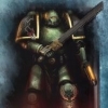
DibbZi Posted June 2, 2011 Share Posted June 2, 2011 Ok so I've been on the board for awhile, and after reading Salamander and Firedrake by Nick Kyme, I've decided to take my failed White Dragons Successor chapter and go full out Salamanders with them. So here is the leader of my army, Vulkan him self. C&C are welcome. *EDIT* Pic's now in lower part of thread, updated model. Link to comment Share on other sites More sharing options...
Retributis Posted June 2, 2011 Share Posted June 2, 2011 http://www.virginmedia.com/images/zoom430x300.jpg is what I am reminded of, sorry :( Really like the drake scale cloak though, interesting patter and nicer than the more usual mundane monotone. Link to comment Share on other sites More sharing options...
Zincite Posted June 2, 2011 Share Posted June 2, 2011 Really good dude, the colours look really good all together. To be honest, the only thing I can see wrong is the eyes. They don't line up quite right, and they could do with some highlighting, try putting a line of golden yellow though the middle, whit some white if you think it needs it. As for the spear tip.... Perhaps try making it more 'fiery?'. As it is, the lines look a little straight, so you might try making them 'intrude' into the other areas. For example, put a orange flame tip from the orange area into the white, if you get my meaning. I haven't really anything as large as that before though, so I'm just throwing out my thoughts. Again, really nice choice of colours, there're really striking. Link to comment Share on other sites More sharing options...
DibbZi Posted June 2, 2011 Author Share Posted June 2, 2011 Really good dude, the colours look really good all together. To be honest, the only thing I can see wrong is the eyes. They don't line up quite right, and they could do with some highlighting, try putting a line of golden yellow though the middle, whit some white if you think it needs it. I'd be all over that, except I don't have the most steady of hands... And the eyes are kinda off kilter I think it's how it was cast...? Link to comment Share on other sites More sharing options...
Jeffy.Gee Posted June 2, 2011 Share Posted June 2, 2011 I'm inclined to agree with Retributius, it does look exactly like a Rocket ice lolly. B) Otherwise I like the model. JG Link to comment Share on other sites More sharing options...
Slyfox1990 Posted June 2, 2011 Share Posted June 2, 2011 http://www.virginmedia.com/images/zoom430x300.jpgis what I am reminded of, sorry :) Really like the drake scale cloak though, interesting patter and nicer than the more usual mundane monotone. Thia is exactly what I thought about when I saw the spear. What lets it down for me as a model on the whole is the brightness of it - I find that there is so much going on my eyes switch all over the place meaning I don't quite enjoy the model for what it is. That may sound stupid but I hope you get where I'm coming from. I reckon you could get away with a simple metal blade with maybe blue highlighting around the edges - I'm personally a firm believer in weapons that look like they'll kill you, not ones that you like to look at. Link to comment Share on other sites More sharing options...
fivepointedstar Posted June 2, 2011 Share Posted June 2, 2011 you could cut off the back power pack fire halo, and flip it around so the face ( salamander symbol) goes towards his right arm that way it flows with his mantle. or it really looks like He'stan got into some really wicked cross-winds. Link to comment Share on other sites More sharing options...
arutha Posted June 4, 2011 Share Posted June 4, 2011 He looks good. Although I think this was more of the inspiration. http://huntingzombies.com/candycornpics/candyCornMan2.jpg Link to comment Share on other sites More sharing options...
DibbZi Posted September 21, 2011 Author Share Posted September 21, 2011 Sorry for the slow progress update... Lots going on. Anyways here is my kit bash of Capt. Pellas Mir'san from IA10. I'll leave you guys to guess what parts were used. Again C&C are welcome. Please no flames. *EDIT* Pics now in lower thread, updated model. Link to comment Share on other sites More sharing options...
ShasVa Posted September 22, 2011 Share Posted September 22, 2011 Nicely done on Mir'San friend. I'm looking to restart my own Sallies army, and this guy will be a part of it, as will all the captains and Tu'Shan, their chapter master. Do you plan to do up a Tu'Shan model too? Link to comment Share on other sites More sharing options...
DibbZi Posted September 22, 2011 Author Share Posted September 22, 2011 Nicely done on Mir'San friend. I'm looking to restart my own Sallies army, and this guy will be a part of it, as will all the captains and Tu'Shan, their chapter master. Do you plan to do up a Tu'Shan model too? Sadly no... I plan on keeping it pretty stock to the GW and IA books. Nothing fancy. I would really love to bring some of the characters from the Tome of Fire trilogy to life with models and stat lines, but you can only have 2 HQ's for normal games and, granted yes I could play 20+ HQ's for an apoc game, but I like being selective. On a side note I got a chance to play mir'san in a game last night and man he is a BEAST!! He took out more crap that Vulkan did. (Didn't help that I was rolling like crap for Vulkan and wiffed on his armor saves.) Back on topic of Mir'san tho. After looking @ the model and looking @ his wargear stats... I don't feel like he's... Living up to the part... I might go back and re-kitbash him... Give him more of a hardcore look. Link to comment Share on other sites More sharing options...
Validar Posted September 22, 2011 Share Posted September 22, 2011 the guide to a nice powerweapon: Paint the weapon the main colour. Give the lower half a wash of a complimentary colour (I did mine with purple and blue wash) When it is dry give they very bottom of the blade another wash. Get your drybrush and white paint. Drybrush carefully over the blade, drybrush more at the tip of the blade and less as you go down the edge. Stop somewhere in the middle. That is what I'd try, it worked really well for me. Link to comment Share on other sites More sharing options...
DavidKits Posted September 23, 2011 Share Posted September 23, 2011 very nice look for the captain sir *smiles and nods* very nice, though it seems he is a bit lacking on the number of weapons as far as i know Captain Mir'san carries 2 power weapons and a combi flamer O.o how do you plan to model them all? i was thinking of using some grey knight blades to rep them when i make up my own version :lol: Link to comment Share on other sites More sharing options...
DibbZi Posted September 23, 2011 Author Share Posted September 23, 2011 Ya know I had some ideas but it's hard to describe with out taking lots o pics. I mighty actually start a WIP log, to get ideas and such. Link to comment Share on other sites More sharing options...
DavidKits Posted September 24, 2011 Share Posted September 24, 2011 *nods* an idea a friend of mine gave me i thought was kinda cool and fitting of salamanders. i'm already building one but hey i don't mind sharing *smiles* basically the idea was to use one of the large swords to rep Cinder his master crafted sword but using either a combat knife or one of the falchiens but have him reverse hold it to show off his two sword fiting style.. and for the combi flamer use the normal storm bolter mount on his arm or some arm mounted weapon but switch out the barrels for a flamer nuzzle head. my friend said the idea for the gun and layout would be fitting for a salamander because Vulken's flamer is wrist mounted as well. Link to comment Share on other sites More sharing options...
DibbZi Posted September 26, 2011 Author Share Posted September 26, 2011 That sounds like a pretty cool idea. But I don't know about the idea of a arm/wrist mounted Combi bolter. Also on a side note, someone from games day this past weekend, put in a squad entry to the Golden Demon of what looks like to be marines malovent or an off color Imp fist. Anyways to get to the point, he gave his SGT a combi flamer, that looks pretty wicked, I'll put a pic if i find one. Link to comment Share on other sites More sharing options...
freakytah Posted September 27, 2011 Share Posted September 27, 2011 Looks good man! The sallie emblem on the shoulder pads is freehand right? I don't suppose you have any tips on how ya do it, I can't ever seem to get it to look good but I'm sick of using transfers! Link to comment Share on other sites More sharing options...
DavidKits Posted September 28, 2011 Share Posted September 28, 2011 I look forward to seeing it man, I love to see new ideas on how to do up combi flamers as i still feel its one of the most underused combi weapons... mostly because ya can next to never find any in model form ;) Link to comment Share on other sites More sharing options...
DibbZi Posted September 28, 2011 Author Share Posted September 28, 2011 Looks good man! The sallie emblem on the shoulder pads is freehand right? I don't suppose you have any tips on how ya do it, I can't ever seem to get it to look good but I'm sick of using transfers! It's a combination of a transfer and painting. The trick is you first put on the transfer using what is called Microsol, which you can buy @ most hobby retailers or online (which is where I got mine) it softens the decal to to conform more to the shoulder pad. Once that is dry, then you end up using paint to blend it back in to the shoulder pad.... Use Chaos Black on the edges then Skull white on the icon it self. Once you do that, you have what looks like a hand painted shoulder Icon. Yeah it might be more work, but IMO well worth it in the end to see the results. Link to comment Share on other sites More sharing options...
Kihriban Posted September 28, 2011 Share Posted September 28, 2011 Looks good man. It's neat and it's clear you've spent quite a bit of time on it. The green armour in particular looks fantastic. I think you're well on your way to having fantastic leaders - there are just a few more final touches to make. Here are the next steps I would take in this order: Vulkan 1. Wash the whole model with watered down badab black - use the special citadel wash, don't just water down black paint - I find it conforms to edges in a very pleasing way. It will also help delineate the brighter scales on the cloak. Someone posted that the model was too uniformely bright and your eyes jumped everywhere, I agree. That's why you need to wash it with black, to get you ready for: 2. Final highlights. Pick the areas of the model you would like to stand out. You have to keep in mind that the model needs to stand out from the rest of the army and that certain parts of this model need to stand out from the rest of this model. Judging by your second model, the red will be unusual in your army. Highlight those back up to the current colour they're at now (or you could just avoid washing them, but I think another wash highlight could only help. I would pick a couple of scales on the cloak to highlight, but leave most of it dark (esp the front inside of the cloak). It's well done, but it distracts from the other parts of the model. I would also focus on the gold and highlight that back up to where it is now. Bright gold over a dark rich green is a striking scheme. 3. You really need to redo the fire. Search "fire" in google images. You'll see that fire is never a solid colour. I would repaint the whole thing a dark crimson red, and then with a watered down blood red, highlight up in snaking streaks from tip to base. Then I would do half red half orange, then just orange, then half orange half yellow, then just yellow. Each time you use a new colour, paint less of it so you still see a fair bit of the previous colour showing through. Remember - it shouldn't be uniform. Each time you paint a new line, either follow a previous line and end it a bit earlier or make a new line (to be done more rarely). Finally, with half yellow half white, a tiny dab on a couple of the tips. 4. A number of people have commented on the spear head. Presumably you were trying to make it look like fire? I would repaint it a solid dark crimson. Then, using a similar technique to #3 I would paint thin lightning bolts on it concentrating on the tip and the edges. You're going for the effect of a glowing power weapon. It's similar to #3, but a) the lines should be thinner, :whistling: there should be a lot less of them (let much more crimson show through) and c) they should concentrate around the tips and edges. 5. Finally, the eyes. I think you're right and they might be a little off, but what model isn't? Use a bit of black "eyeliner" to even them out. Also, highligh the top of them lengthwise with a thin streak of orange/yellow as if the eyes were bulbous lenses instead of flat. Mir'san 1. I really like what you've done with this guy. 2. I would probably do his sword in the same red as above to make him stand out from the rest of the army, but that's just personal preference. Link to comment Share on other sites More sharing options...
DibbZi Posted September 28, 2011 Author Share Posted September 28, 2011 Looks good man. It's neat and it's clear you've spent quite a bit of time on it. The green armour in particular looks fantastic. I think you're well on your way to having fantastic leaders - there are just a few more final touches to make. Here are the next steps I would take in this order: Vulkan 1. Wash the whole model with watered down badab black - use the special citadel wash, don't just water down black paint - I find it conforms to edges in a very pleasing way. It will also help delineate the brighter scales on the cloak. Someone posted that the model was too uniformely bright and your eyes jumped everywhere, I agree. That's why you need to wash it with black, to get you ready for: 2. Final highlights. Pick the areas of the model you would like to stand out. You have to keep in mind that the model needs to stand out from the rest of the army and that certain parts of this model need to stand out from the rest of this model. Judging by your second model, the red will be unusual in your army. Highlight those back up to the current colour they're at now (or you could just avoid washing them, but I think another wash highlight could only help. I would pick a couple of scales on the cloak to highlight, but leave most of it dark (esp the front inside of the cloak). It's well done, but it distracts from the other parts of the model. I would also focus on the gold and highlight that back up to where it is now. Bright gold over a dark rich green is a striking scheme. 3. You really need to redo the fire. Search "fire" in google images. You'll see that fire is never a solid colour. I would repaint the whole thing a dark crimson red, and then with a watered down blood red, highlight up in snaking streaks from tip to base. Then I would do half red half orange, then just orange, then half orange half yellow, then just yellow. Each time you use a new colour, paint less of it so you still see a fair bit of the previous colour showing through. Remember - it shouldn't be uniform. Each time you paint a new line, either follow a previous line and end it a bit earlier or make a new line (to be done more rarely). Finally, with half yellow half white, a tiny dab on a couple of the tips. 4. A number of people have commented on the spear head. Presumably you were trying to make it look like fire? I would repaint it a solid dark crimson. Then, using a similar technique to #3 I would paint thin lightning bolts on it concentrating on the tip and the edges. You're going for the effect of a glowing power weapon. It's similar to #3, but a) the lines should be thinner, B) there should be a lot less of them (let much more crimson show through) and c) they should concentrate around the tips and edges. 5. Finally, the eyes. I think you're right and they might be a little off, but what model isn't? Use a bit of black "eyeliner" to even them out. Also, highligh the top of them lengthwise with a thin streak of orange/yellow as if the eyes were bulbous lenses instead of flat. Mir'san 1. I really like what you've done with this guy. 2. I would probably do his sword in the same red as above to make him stand out from the rest of the army, but that's just personal preference. Kihriban, thank you for the words of advice, I do plan on finishing up the eyes alittle more, and the spear I will looking in to what you mentioned. Cause I think it needs more of a better look then a candy corn. And moving on to mir'san the more I look @ that model the more I think he looks too static... just very... Not capt. looking... I have some ideas that I'm going to try out with him. He was a great first attempt but 2 time might work out better. Link to comment Share on other sites More sharing options...
DibbZi Posted May 15, 2012 Author Share Posted May 15, 2012 Ok so after taking a break, and moving and having more children, I'm back in the game. I re did my mir'san model. so here he is. http://farm9.staticflickr.com/8014/7204192070_3c4163e3b2_c.jpg Also here is an updated Vulkan, I fixed the spear from looking like a piece of candy corn and fixed the crookedness of the eyes. http://farm6.staticflickr.com/5441/7204277044_307cdec000_c.jpg As always C&C is welcome and hopefully I'll be posting more. OH and here is just a Tact. Marine with a melta. http://farm6.staticflickr.com/5198/7204380218_7d46b8ae42_c.jpg Link to comment Share on other sites More sharing options...
Task Force Gauntlet Posted May 20, 2012 Share Posted May 20, 2012 Mir'san hurts my eyes dude. I'm not kidding, he's so bright and has so many different colors on him. Also, due to the colors you can't even tell he's a Salamander without prior knowledge. Link to comment Share on other sites More sharing options...
nurglespuss Posted May 20, 2012 Share Posted May 20, 2012 Some really good efforts in there, i can see you've been working hard to get them looking good :devil: I'm impressed with Vulkan, he looks great. As for Mir'san I think his 'brightness' could be cured with a wash (I would mix green&black ink for the green armour, and brown&black for everything else. Keep up the good work ;) Link to comment Share on other sites More sharing options...
DibbZi Posted May 21, 2012 Author Share Posted May 21, 2012 Hmm... Maybe I'll change the pic again, he obviously was taken in direct sunlight. He's actually a darker color then what is portrayed. And there is a wash on every part of MIr'san, I think the lighting is just throwing it off. But thanx for the input guys. I hope to have his command squad started soon. Just waiting on a few bitz. Link to comment Share on other sites More sharing options...

Recommended Posts
Archived
This topic is now archived and is closed to further replies.