
Dark Sensei
-
Posts
283 -
Joined
-
Last visited
4 Followers



About Dark Sensei

Dark Sensei's Achievements






-
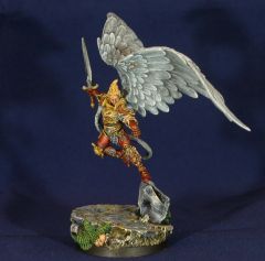
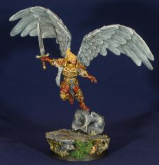
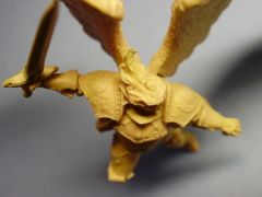
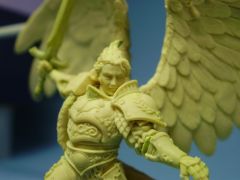
Final green and first painting of some Crimson angel you might recognise
-
-
 Disruptor_fe404 reacted to a post in a topic:
Sentinels: 2025 - The Progress Implacable - AoD Kill Team
Disruptor_fe404 reacted to a post in a topic:
Sentinels: 2025 - The Progress Implacable - AoD Kill Team
-
Midnightmare reacted to a post in a topic:
Flesh Eaters
-
Thanks Frater for your kind words, I will be more than glad to see more stuff coming.
- 777 replies
-
- 1
-
-
- Flesh Eaters
- blood angels
- (and 3 more)
-
Hmmm, firstly my apologies for my hardly understandable English. You have a splendid army, ful of ideas and it reminds me of the astonishing work Frater Desmodius did, some times ago. But IMHO, you fell into excess on some minis and its a frequent mistake around some "bloody" or "gothic" styles. For example, your golden champion with an axe is way perfect but the cloak is a mistake, it overcharges the mini in a rather rococco way. Imagine, i dunno... Say the Joker. He is a friggin bad guy ! Well, he is more scarry as a nurse than a guy with a cloak of skulls if you see what I mean. In miniature painting, and in fact in all storytellings (a good miniature tells a story), the strongest effects come from contrasts. Contrasts in shades, forms and of course contrasts in fluff depiction. Here you've got an ultra psycho bloodthirsty loyalist chapter and its a strong and excellent contradiction. This can be epitomised (not sure of that word) by the way miniatures describes that fact, depicting a straight uniform unit and clean markings followed by a Rhino with empaled civilians. A man in impeccable war-suit with a drop of blood leaking from his mouth. Khorne Berserkers butchering a school is war, a loyalist chapter doing the same for some dark reason is shocking atrocity. Hmmm you have seen many pictures of young starving boys, I guess, its sad be we all grew accustomed to this. Just add a "bird" and you've got a 1994 Pullitzer price by Carter.
-
Some very impressive stuff around. An auld thing of mine : Vinko Arg
-
[Artwork] 'Libris Primaris'
Dark Sensei replied to Aerion the Faithful's topic in + ARTISANS' WORKSHOP +
A very elegant work once again, dude. DS -
[Artwork] 'Libris Primaris'
Dark Sensei replied to Aerion the Faithful's topic in + ARTISANS' WORKSHOP +
The light-work is splendid. I understand the fact you do not want to take things too dark when I see whan you can do with little light but there is nothing above Aequo to this day... Hmmm not even Yellow 8). DS -
[Artwork] 'Libris Primaris'
Dark Sensei replied to Aerion the Faithful's topic in + ARTISANS' WORKSHOP +
Hi Nicolas ! You seem to develop a taste for intricate drawings with plenty of people and well... ITS ACE ! Therefore, I saw Horus and the Emperor at quite the same size and of course both of us less gigantic, this is a bit too much IMHO. Oh, I discovered "The past recedes" recently and its a wonderfull idea with a splendid realisation. Many many congrats !!! DS -
[Artwork] 'Libris Primaris'
Dark Sensei replied to Aerion the Faithful's topic in + ARTISANS' WORKSHOP +
Though I have some "unfinished" feeling about the warmaster, think the claw is somehow un-necessary (and I'm not sure but maybe quite "un-fluffy" too), you gave him distant and calm features that fit perfectly. JK is a killer ! At last some serious portrait for this primarch that endured the hi-heels and oversized topknot from Blanche the lucious for waaaaaaaay too long. Now there is presence, strengh, honor, anger... That's a Khan ! Sending ya a Primarch too in PM... DS -
[Artwork] 'Libris Primaris'
Dark Sensei replied to Aerion the Faithful's topic in + ARTISANS' WORKSHOP +
Grats friends. Nice to see you can keep some time for this splendid project. I'm on some similar one atm so I know how time consuming this might be. DS -
Showcase: Post your Dreadnoughts
Dark Sensei replied to Spacefrisian's topic in + ARTISANS' WORKSHOP +
Uppage !!! Sorry for the poor quality of the photos but I had a choice to make between apologies for photos or apologies for the painting. Pride chose "photo-logies". http://i145.photobucket.com/albums/r226/Dark-Sensei/Photo019.jpg http://i145.photobucket.com/albums/r226/Dark-Sensei/Photo020.jpg DS -
[Artwork] 'Libris Primaris'
Dark Sensei replied to Aerion the Faithful's topic in + ARTISANS' WORKSHOP +
Hey Nicolas, squats in p-a are not well seen around, even mead-enlarged ones !!!! Dammit dude, you made good choices ! The beardy truckdrider looking primarch is just great. I was kinda bored by the well shaved youngster we see all the time. THIS IS COOOOOOOOOOOOOL ! DS -
[Artwork] 'Libris Primaris'
Dark Sensei replied to Aerion the Faithful's topic in + ARTISANS' WORKSHOP +
This Primarch is indeed your favorite one, friend. I can witness :P ! Thos is one of your trademark but IMHO, he has a little too arrogant chin. This apart, you gave him the perfect touch of strenght and grim reserve. Its a spendor ! Hmmm some new Iron souls, one day or another ? DS -
[Artwork] 'Libris Primaris'
Dark Sensei replied to Aerion the Faithful's topic in + ARTISANS' WORKSHOP +
Very impressive my dear friend. You gained in finesse and balance while keeping your very own style. Another Yellow on the tablework 8) ? Talk'n about yellow, your Dorn is impressive too. Hey ! There are Primarchs undone yet ! Keep on going, its a constant pleasure. DS -
[Artwork] 'Libris Primaris'
Dark Sensei replied to Aerion the Faithful's topic in + ARTISANS' WORKSHOP +
:) Hey Aerion, pleasure to see you around ! Daddy and first son are not new to us and always a pleasure to see. Those new ones are splendid. Lion is resplendant and regal, all perfect. There is also a perfect contrast between the stern black armar and the delicate background. Really one of your best (and its a pain for me to say that about the first fallen primarch and initiator of the marines in... robes ). This new version of Sanguinius is just great but you should have done wider wings to my opinion. His rococco blade (seriously, you've seen the initial drawings of it ? Looks like a 90's high elfe toothpicks with hearts and everything...) could have been a good idea too for swords are the mark of elegant warriors (eating with fingers is NOT ). Perturabo is a must ! Armour is great, pose is super, the face is the very best (you can see a strong planning mind and unshakable determination), short officer haircut is the right choice too. Hammer seems a bit "different". Dunno how to say that, the colour, the shape and decorations... I'd see an rougher thing is hands of that size. Rogal'll be cool, can't wait to see. DS