KaosRaptor Posted July 13, 2010 Share Posted July 13, 2010 Is that green stuff rope holding that parchment in place? I think you'll find thats a shoulder pad from the Death Company sprue. :woot: Loving the work so far, nice conversions, and the blue is painted really well. The highlights are (imho) bright, but not too bright, well done. Even if they are Ultrasmurfs, it's all looking great! Can't wait to see more. Link to comment Share on other sites More sharing options...
Martini Henrie Posted July 13, 2010 Share Posted July 13, 2010 Progress is looking great, I look forward to seeing 'em completed. Pre-mixing your shades in pots is for winners, as you get consistant results across the army which improves an already good job. Link to comment Share on other sites More sharing options...
ozris Posted July 13, 2010 Share Posted July 13, 2010 Some nice conversions and a good looking paintjob on all the models. :) Only thing mentionable is that to me, the head on the captain/champion (the one using the older version Company Champ's body) is way to big proportionwise compared to the rest of the rather slim body. Other than that, keep up the good work B) Link to comment Share on other sites More sharing options...
Capt. Jack Posted July 13, 2010 Author Share Posted July 13, 2010 Greetings! Thanks for all the comments guys, really appreciated! :rolleyes: @ Ozris: I can see what you mean, but much of that is from the angle of the image itself, I shall have to post more pics when I start painting him! Well, today I spent about 30 mins converting up my Epistolary, Gaius. He's a total mixture of bitz, and I rather like what I've achieved. He's still WiP so be gentle! Thanks again! Capt. Jack Link to comment Share on other sites More sharing options...
Pig Of Sparta Posted July 13, 2010 Share Posted July 13, 2010 Possibly the best kitbashed 'plastic' librarian I've ever seen. I can't think of a single thing I don't like about him. I particularly like the way that you've represented the psyhic hood with the 'death mask'. Oh and thanks for the blue recipe by the way. I'm missing a couple of the paints right now, but it'll go in my note book of colour techniques for later use ;) cheers James Link to comment Share on other sites More sharing options...
KaosRaptor Posted July 13, 2010 Share Posted July 13, 2010 Wow. ;) That is one awesome Librarian! Couple of quick bitz questions: 1. The staff, is that from Tigurius? 2. The tabard, is that part of the company champion chest? Or a seperate bit? Loving the use of the deathmask too, nice touch! More more more! :P Link to comment Share on other sites More sharing options...
Pig Of Sparta Posted July 14, 2010 Share Posted July 14, 2010 I'm 99% sure that it's Tigurius force staff, but I'm 100% certain (I have one in my bits box) that the tabard is attached to the company champion chest piece :( James Link to comment Share on other sites More sharing options...
halfling hopperston Posted July 14, 2010 Share Posted July 14, 2010 i may be wrong but i think that's the staff from the old blister librarian that had a staff... tigrus's staff has a wreath around the goats skull this one did not. Link to comment Share on other sites More sharing options...
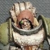
Brother_Fatiswon Posted July 14, 2010 Share Posted July 14, 2010 the plastic head is way too big for EC's metal body. +2 judgements are hard to shake, and the head angle to the feet .... maybe if the head was shifted to the models left, and more in line.. idk... also don't really like the ultra marine badge + the dual high finned should pads, imo, i feel one is perfect, and two is overkill. Same with the Libby... yeah, great kitbash and every thing everone eles said.. .sure, but you should use the eagle back else where. Link to comment Share on other sites More sharing options...
Dr. Maniac Posted July 14, 2010 Share Posted July 14, 2010 Wow! Very amazing work and painting. Link to comment Share on other sites More sharing options...
Capt. Jack Posted July 14, 2010 Author Share Posted July 14, 2010 Hey guys! Thanks for the comments, really happy you like the librarian, he was very fun to make! Glad you all seem to like the death-mask idea, was afraid people wouldn't! Still a couple of details to add, like rivets to the knee pads etc. Do you guys think i should do anything with the right shoulderpad (plain one), or should I leave it for freehand? Wow. That is one awesome Librarian! Couple of quick bitz questions:1. The staff, is that from Tigurius? 2. The tabard, is that part of the company champion chest? Or a seperate bit? Loving the use of the deathmask too, nice touch! More more more! ^_^ Thanks dude! The staff is from the 2nd ed Epistolary mini (he's pretty similar to Tigger), and the torso is from the company champion. Stay tuned! Capt. Jack Link to comment Share on other sites More sharing options...
koran Posted July 14, 2010 Share Posted July 14, 2010 Nice work dude. The bitz have been used together well, I would greenstuff some horns onto the skull on the left shoulder pad as its the librarian symbol. I cant say I like the head. I just dont feel it. It just doesnt look right, doesnt have a psychic hood and (most importantly) Ive seen your past librarians and (although I might let if fly for someone else) I know you can do better. As always you make the model interact with the base very well but there it something that doesnt seem to have the right flow of movement to me.... It took me looking at it for a few minutes to work out what it is but I think its the position of the staff.... The pose it is in (swept back) is typical of someone running (especially in a chinese martial arts film ;)) but the rest of him is only walking forward. I would say you could change the legs to be running but then the arm with the eagle wouldnt look right which would mean even more work. So so you dont have to change a lot I would re-position the staff arm. Possibly to have it resting on the floor. You could even have it melting into the stone floor a little to add to the interaction between the librarian and its base. It sounds like Ive slated a lot but really its only two things. The staff and the head, I just wanted to make sure I explain why I dont like it and not be one of those failures that say they dont like something and then dont help improve it, you know who Im talking about :P The rest of the composition is damn nice and coupled with freehand I know it will look great with a little work. Link to comment Share on other sites More sharing options...
koran Posted July 14, 2010 Share Posted July 14, 2010 [Deleted: Double post] Link to comment Share on other sites More sharing options...
glider0880 Posted July 14, 2010 Share Posted July 14, 2010 Real nice! Link to comment Share on other sites More sharing options...
Capt. Jack Posted July 14, 2010 Author Share Posted July 14, 2010 Hey all! Thought I'd tinker around with Gaius, and this is what I've come up with! @ Koran: I understand what you mean, though I'm trying to make him look stationary, though it doesn't show from the pics! And I've changed the staff, though I like the idea of an inbuilt psychic hood in the helmet. And also the right (his right) shoulderpad - I've added the Librarium skull, hope it looks good (if a little blurry!) Otherwise, you can see I've done the shoulder seal with GS, and there are further details (rivets) on the knee pads. (Sorry for bluriness!) Let me know what you guys think! Capt. Jack Link to comment Share on other sites More sharing options...
Jellitin Posted July 15, 2010 Share Posted July 15, 2010 I think he looks very nice! Also, though he does look good with the death mask, I feel he could look better with a different face. Although he's your guy, so ignore me if you will. I have to say, though, he looks pretty great. I love the staff, especially with the reposition, and the eagle is a generally cool touch. A very cool model. Link to comment Share on other sites More sharing options...
Power Hungry Monkey Posted July 15, 2010 Share Posted July 15, 2010 Another superb Smurf there Cpt. Jack (Harkness?). The death-masks work really well for Ultramarines as it really plays to the 'classical' theme they have going. Keep up the good work. The blue armour on the squad looks great so far Link to comment Share on other sites More sharing options...
millest Posted July 15, 2010 Share Posted July 15, 2010 they are superb, i know im probably missing something but where are the helmets from for the marines, they look awesome cheers millest Link to comment Share on other sites More sharing options...
Shortsonfire79 Posted July 15, 2010 Share Posted July 15, 2010 Your blue is most stunning. It is rich and deep. Very well executed. Your use of Steam Knight heads is wonderful, and the librarian looks great. The cleanliness of your sculpting show that you know exactly what you are doing and are very talented. Link to comment Share on other sites More sharing options...
koran Posted July 15, 2010 Share Posted July 15, 2010 I dont know about other people but I think it looks much better with the staff like that, it matches the head position and the rest of the model. Still dont like the helmet but if you do then thats all good (I just dont know it matches your pre-heresy theme. I dont know if Ive ever seen a pre-heresy psychic hood (other than on a thousand son) so you could really whip out something interesting and new. Im suprised you did the librarian symbol on that shoulder pad.... Wasnt there already a skull on the other side to use which would mean you can do some bad-ass freehand on the other clean shoulder pad. Link to comment Share on other sites More sharing options...
Capt. Jack Posted July 15, 2010 Author Share Posted July 15, 2010 Another superb Smurf there Cpt. Jack (Harkness?). The death-masks work really well for Ultramarines as it really plays to the 'classical' theme they have going. Keep up the good work. The blue armour on the squad looks great so far Cheers dude! Coming from such a skilled individual as yourself, this is high praise indeed! As for Capt. Jack, Jack is my name, and I used to dress like a pirate disturbingly frequently! So a sort of 'Steve the Pirate' thing going on there! :P Im suprised you did the librarian symbol on that shoulder pad.... Wasnt there already a skull on the other side to use which would mean you can do some bad-ass freehand on the other clean shoulder pad. Well, the skull on his left shoulderpad is a little busy; there's a mini wreath on it for starters, and not really enough room for the horns. IMHO anyhow! Right well, I'm off to tinker on my little men, stay tuned, the next update is bought to be rather BIG! Capt. Jack Link to comment Share on other sites More sharing options...
glider0880 Posted July 15, 2010 Share Posted July 15, 2010 Lovely stuff here, Well done. Link to comment Share on other sites More sharing options...
Capt. Jack Posted July 16, 2010 Author Share Posted July 16, 2010 Hello all, Been working on some of my termies in the last couple of days, and they're a long way from being finished. I need to fill in the legs, add rivets and maybe a couple of Aquilas here and there, do some loincloths, and MAYBE some half cloaks, to hang from the rings on the shouldpads. Also, I'll be adding a fairly long haft to each of the blades, making 'Thunder Glaives' or the like. Let me know what you guys think would look good! Sergeant Diomedes: Brother Kallikrates: Brother Nerva: Brother Timaeus: Brother Valentinus: And finally, a group shot: Comments and criticism welcome! Capt. Jack Link to comment Share on other sites More sharing options...
Terminatorinhell Posted July 16, 2010 Share Posted July 16, 2010 THose are some really nice termies but seeing them as assault termies, I would think they would need their helmets but thats just me. Link to comment Share on other sites More sharing options...
Capt. Jack Posted July 16, 2010 Author Share Posted July 16, 2010 THose are some really nice termies but seeing them as assault termies, I would think they would need their helmets but thats just me. Cheers bro! I've always considered terminator armour to be so bad-ass that they include a small but powerful shield generator to guard the face. I like this idea, as in battle, the heroes are more inspiring to their comrades when their faces are exposed. Link to comment Share on other sites More sharing options...

Recommended Posts
Archived
This topic is now archived and is closed to further replies.