fivepointedstar Posted May 17, 2013 Share Posted May 17, 2013 I love the Angel of Adamantine guy. pure win in my books. Like DAT said.. The face. So angelic, yet he's a stone cold killer. Link to comment https://bolterandchainsword.com/topic/240161-clever-girl-wink-wink-nudge-nudge/page/76/#findComment-3373627 Share on other sites More sharing options...
Unknown Chronicler Posted May 17, 2013 Share Posted May 17, 2013 Beautiful marines greyall they look amazing! I can't wait to see more Link to comment https://bolterandchainsword.com/topic/240161-clever-girl-wink-wink-nudge-nudge/page/76/#findComment-3373853 Share on other sites More sharing options...
Greyall Posted May 23, 2013 Author Share Posted May 23, 2013 A cartwheel full of sorries, guys, thank you very much for the kind words. I'm currently working on DK2000's heraldry. But I'm learning how to draw on a tablet, so it may take a littlish. After that I'll (re)do a practice marine and then return to the other heraldries. Cheers, everyone, thank you so much, once again. Link to comment https://bolterandchainsword.com/topic/240161-clever-girl-wink-wink-nudge-nudge/page/76/#findComment-3378677 Share on other sites More sharing options...
Aqui Posted May 23, 2013 Share Posted May 23, 2013 A cartwheel full of sorries, guys, thank you very much for the kind words. I'm currently working on DK2000's heraldry. But I'm learning how to draw on a tablet, so it may take a littlish. After that I'll (re)do a practice marine and then return to the other heraldries. Cheers, everyone, thank you so much, once again.Looking forward to seeing it Link to comment https://bolterandchainsword.com/topic/240161-clever-girl-wink-wink-nudge-nudge/page/76/#findComment-3378681 Share on other sites More sharing options...
fivepointedstar Posted May 23, 2013 Share Posted May 23, 2013 Sounds like a good thing. I Hope the tablet is working out better for you. Link to comment https://bolterandchainsword.com/topic/240161-clever-girl-wink-wink-nudge-nudge/page/76/#findComment-3378692 Share on other sites More sharing options...
Ioldanach Posted May 23, 2013 Share Posted May 23, 2013 It's been far too long since I've visited. All of the prizes look great. Link to comment https://bolterandchainsword.com/topic/240161-clever-girl-wink-wink-nudge-nudge/page/76/#findComment-3378870 Share on other sites More sharing options...
TrashMan Posted May 24, 2013 Share Posted May 24, 2013 Amazing art as always. Makes me wish I was here for hte contest, but then again, I'm usually behind the news curve. Link to comment https://bolterandchainsword.com/topic/240161-clever-girl-wink-wink-nudge-nudge/page/76/#findComment-3379202 Share on other sites More sharing options...
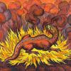
Greyall Posted June 18, 2013 Author Share Posted June 18, 2013 Hey, everyone. Let's skip the part where I feel like xenos dung for taking this long to post. Anyway, remember Mazad Vur'me, the Salamanders Librarian? http://th07.deviantart.net/fs71/PRE/i/2012/257/f/e/mazad_vur__me_by_greyall-d5epal7.jpg Nice concept, but one of my weakest drawings. This shall not stand... http://fc07.deviantart.net/fs71/i/2013/168/1/2/vur_me_reborn_by_greyall-d69ias6.jpg Now, for all those due a Chapter Symbol...it's already being taken care of, muchos sorries for the delay. Hope you like Vur'me's new look, mates. Cheers. Link to comment https://bolterandchainsword.com/topic/240161-clever-girl-wink-wink-nudge-nudge/page/76/#findComment-3396156 Share on other sites More sharing options...
chapter master Benji Posted June 18, 2013 Share Posted June 18, 2013 Good god Greyall. That is SICK! Link to comment https://bolterandchainsword.com/topic/240161-clever-girl-wink-wink-nudge-nudge/page/76/#findComment-3396167 Share on other sites More sharing options...
Firepower Posted June 18, 2013 Share Posted June 18, 2013 Much better :) Line art fire and tedious levels of fine detail scales earns you good points. The awkward crotch-dragon knocks a few off, though. The bottom right of the scale-hide-robe thing is messing with my eyes. It seems impossible the way it is drawn, while the flowing scriptures and what appears to be a fire on his foot make the shape even harder to really wrap my head around. Link to comment https://bolterandchainsword.com/topic/240161-clever-girl-wink-wink-nudge-nudge/page/76/#findComment-3396210 Share on other sites More sharing options...
Quixus Posted June 18, 2013 Share Posted June 18, 2013 Much better Line art fire and tedious levels of fine detail scales earns you good points. The awkward crotch-dragon knocks a few off, though.I agree, he looks awesome. I don't mind the codpiece, but I think you should have left more of the helmet visible through/around the flames. Link to comment https://bolterandchainsword.com/topic/240161-clever-girl-wink-wink-nudge-nudge/page/76/#findComment-3396231 Share on other sites More sharing options...
fivepointedstar Posted June 18, 2013 Share Posted June 18, 2013 Awe yeah buddy!! I love the look of this guy. The flames, the scales, and the flames... But i'm a sucker for dragon-like asartes. ( I imagine this guy with red, and black armor thou) But I've alway's liked your reptile themed marines since I saw your Devourers. Keep up the awesome work Greyall. Link to comment https://bolterandchainsword.com/topic/240161-clever-girl-wink-wink-nudge-nudge/page/76/#findComment-3396543 Share on other sites More sharing options...
Dark Sensei Posted June 18, 2013 Share Posted June 18, 2013 Good Lord, this is dementia ! (not too fan of the scally face though, il breaks the lines, firebreathing is a cool idea though) Cheerz frater, Be blessed by Rage Link to comment https://bolterandchainsword.com/topic/240161-clever-girl-wink-wink-nudge-nudge/page/76/#findComment-3396560 Share on other sites More sharing options...
Greyall Posted June 18, 2013 Author Share Posted June 18, 2013 Good god Greyall. That is SICK! I must admit, I'm pretty swollen with pride with this guy, it's definitely one of my best. Many thanks, mate. Much better Line art fire and tedious levels of fine detail scales earns you good points. The awkward crotch-dragon knocks a few off, though. The bottom right of the scale-hide-robe thing is messing with my eyes. It seems impossible the way it is drawn, while the flowing scriptures and what appears to be a fire on his foot make the shape even harder to really wrap my head around. "Awkward crotch-dragon"...straight to the sig, mate =) The flames on his feet are armour deco, not "real" flames. His left leg is almost stretched to the back. As for the flow of kilts and scriptures, I take almost full liberties with that. I [usually] draw miniatures, not scenes, so I think in terms of "visual marketing". There are certain poses, details and "physics" that are more appealing to the eye, and I try to employ them as much as I can without sacrificing realism. Stretched mantles and capes, flowing scrolls, etc. Sometimes I think about this straightforwardness of yours, Fire, and I've reached a verdict: it's public service, what you do, mate. Thank you. Much better Line art fire and tedious levels of fine detail scales earns you good points. The awkward crotch-dragon knocks a few off, though.I agree, he looks awesome. I don't mind the codpiece, but I think you should have left more of the helmet visible through/around the flames. I was thinking the very same thing while drawing him, but sometimes that "urge" and "frustration" just add to the magic of the mini. Gracias, man. Awe yeah buddy!! I love the look of this guy. The flames, the scales, and the flames... But i'm a sucker for dragon-like asartes. ( I imagine this guy with red, and black armor thou) But I've alway's liked your reptile themed marines since I saw your Devourers. Keep up the awesome work Greyall. Thanks, matey, every time I draw scales on power armour I remember your love for draconic astartes. And now I want to draw a Devourer. Good Lord, this is dementia ! (not too fan of the scally face though, il breaks the lines, firebreathing is a cool idea though) Cheerz frater, Be blessed by Rage Aye, the scaled helm isn't too pleasing to the eye, but it is kind of "mandatory" for a guy who think's he's a Salamander-made-Superhuman. Glad you like it, mate. Link to comment https://bolterandchainsword.com/topic/240161-clever-girl-wink-wink-nudge-nudge/page/76/#findComment-3396903 Share on other sites More sharing options...
Firepower Posted June 19, 2013 Share Posted June 19, 2013 Much better Line art fire and tedious levels of fine detail scales earns you good points. The awkward crotch-dragon knocks a few off, though. The bottom right of the scale-hide-robe thing is messing with my eyes. It seems impossible the way it is drawn, while the flowing scriptures and what appears to be a fire on his foot make the shape even harder to really wrap my head around. "Awkward crotch-dragon"...straight to the sig, mate =) The flames on his feet are armour deco, not "real" flames. His left leg is almost stretched to the back. As for the flow of kilts and scriptures, I take almost full liberties with that. I [usually] draw miniatures, not scenes, so I think in terms of "visual marketing". There are certain poses, details and "physics" that are more appealing to the eye, and I try to employ them as much as I can without sacrificing realism. Stretched mantles and capes, flowing scrolls, etc. Sometimes I think about this straightforwardness of yours, Fire, and I've reached a verdict: it's public service, what you do, mate. Thank you. I'm always glad to knock my betters down a peg or two Also, "The awkward crotch-dragon knocks a few off, though," quoted outside of context is...I'm not sure whether it's funny or scary. Scunny maybe? Link to comment https://bolterandchainsword.com/topic/240161-clever-girl-wink-wink-nudge-nudge/page/76/#findComment-3396982 Share on other sites More sharing options...
Kol Saresk Posted June 19, 2013 Share Posted June 19, 2013 It is a good remake. One point of note. It might be due to lack of usage concerning axes on my part, but doesn't it so close to the head end up sacrificing force for control? I mean, if I remember a project I did on them, they were made to sort of swing on their own so it just seems to me that if he were weilding two axes, he would just hold them closer to the bottom of the hadt to make it easier on himself and let the axes do what they were made to do. Not a biggie, just a personal curiosity. Link to comment https://bolterandchainsword.com/topic/240161-clever-girl-wink-wink-nudge-nudge/page/76/#findComment-3397030 Share on other sites More sharing options...
Greyall Posted June 19, 2013 Author Share Posted June 19, 2013 Aye, but I dislike seeing the grip too close to the bottom, it doesn't convey the same sense of strength. Also, a higher grip means less innertia on the axe head and thus, more mobility/quicker and more controlled strikes. Link to comment https://bolterandchainsword.com/topic/240161-clever-girl-wink-wink-nudge-nudge/page/76/#findComment-3397102 Share on other sites More sharing options...
Hyaenidae Posted June 19, 2013 Share Posted June 19, 2013 The dragon on the chest plate has to be my favorite detail, very clever, man. All and all, I like him. He's quite a badass. Link to comment https://bolterandchainsword.com/topic/240161-clever-girl-wink-wink-nudge-nudge/page/76/#findComment-3397410 Share on other sites More sharing options...
Messor Posted June 24, 2013 Share Posted June 24, 2013 Wow, that's fantastic! I'm not sure whether I like the axes, backpack icon or flaming face the most, but that's amazing work! Link to comment https://bolterandchainsword.com/topic/240161-clever-girl-wink-wink-nudge-nudge/page/76/#findComment-3400553 Share on other sites More sharing options...
Greyall Posted June 25, 2013 Author Share Posted June 25, 2013 Many thanks, mate. I was about to start on your heraldry, having finished DK2000's (should be up later tonight). The Force is strong with you. PS: I mean the Emperor, of course. Link to comment https://bolterandchainsword.com/topic/240161-clever-girl-wink-wink-nudge-nudge/page/76/#findComment-3400720 Share on other sites More sharing options...
Forgeborn Posted June 25, 2013 Share Posted June 25, 2013 Holy nut-balls that salamander is like... inspiring. making me want to start modeling HQ's Link to comment https://bolterandchainsword.com/topic/240161-clever-girl-wink-wink-nudge-nudge/page/76/#findComment-3400826 Share on other sites More sharing options...
Greyall Posted June 25, 2013 Author Share Posted June 25, 2013 Death Knight 2000, come and get it. http://fc02.deviantart.net/fs70/i/2013/176/5/6/exsanguinators_by_greyall-d6ankrl.jpg Exsanguinators Blood Angels Successors who have a hard time clotting wounds and must drain a poor sod every time they want to talk to their Chapter Master. Welcome to grimdarkland, folks. I wanted to convery their obsession with blood, but also the "medicinal" angle on that matter, since the Chapter is pretty much forced to deal with the bloody - heh - issue. This is also why some angels are present, this is still a loyal group of Emperor and Sanguinius-serving Marines. Next for something completely different, and some more heraldry after that. Hope you like it, boyz. Link to comment https://bolterandchainsword.com/topic/240161-clever-girl-wink-wink-nudge-nudge/page/76/#findComment-3401220 Share on other sites More sharing options...
Aqui Posted June 25, 2013 Share Posted June 25, 2013 I really like it Quite a different kind of image compared to other BA related Chapters. Link to comment https://bolterandchainsword.com/topic/240161-clever-girl-wink-wink-nudge-nudge/page/76/#findComment-3401225 Share on other sites More sharing options...
Greyall Posted June 25, 2013 Author Share Posted June 25, 2013 Aye, if it wasn't for the Angels and the droplets this would be way out of the BA's jurisdiction. Makes sense, I think, this Chapter is truly divergent from its parent Legion. Link to comment https://bolterandchainsword.com/topic/240161-clever-girl-wink-wink-nudge-nudge/page/76/#findComment-3401228 Share on other sites More sharing options...
Aqui Posted June 25, 2013 Share Posted June 25, 2013 Aye, if it wasn't for the Angels and the droplets this would be way out of the BA's jurisdiction. Makes sense, I think, this Chapter is truly divergent from its parent Legion.I wasn't sure of the cross, because of its significance with other Chapters, but the more I look at it... Link to comment https://bolterandchainsword.com/topic/240161-clever-girl-wink-wink-nudge-nudge/page/76/#findComment-3401230 Share on other sites More sharing options...
Recommended Posts
Archived
This topic is now archived and is closed to further replies.