Jacinda Posted February 15, 2017 Share Posted February 15, 2017 I want my plastic sisters! I have been considereing buying up all the Cel and geminae modles I can find just to convert an seriphim squad. Vigrid Of Asgaror, Ranwulf, Interrogator-Chaplain Ezra and 1 other 4 Back to top Link to comment Share on other sites More sharing options...
CaptainHelion Posted February 16, 2017 Share Posted February 16, 2017 Holy heck Link to comment Share on other sites More sharing options...
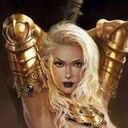
Kastor Krieg Posted February 16, 2017 Share Posted February 16, 2017 The boob armour is just stupidly exaggerated. Teetengee and Servant of Dante 2 Back to top Link to comment Share on other sites More sharing options...
dracpanzer Posted February 16, 2017 Share Posted February 16, 2017 Agreed. The rest is interesting, but the boob plate takes it to an absurd level. Link to comment Share on other sites More sharing options...
Willy Pete Posted February 16, 2017 Share Posted February 16, 2017 The heels are 'interesting' too. If they were cavalry it could make sense. But for infantry, it doesn't work and just looks stupid. Link to comment Share on other sites More sharing options...
Servant of Dante Posted February 16, 2017 Share Posted February 16, 2017 The heels are 'interesting' too. If they were cavalry it could make sense. But for infantry, it doesn't work and just looks stupid. I mean, if you're really going to put heels on Sisters (never want to see that across an entire range of models *shiver*) in art or something, go full on Blanche (case in point the 2E codex cover) :D Link to comment Share on other sites More sharing options...
WarriorFish Posted February 16, 2017 Share Posted February 16, 2017 It's the body proportions that are weirding me out, but it's a technically good piece if not correct. Link to comment Share on other sites More sharing options...
Jacinda Posted February 16, 2017 Share Posted February 16, 2017 Oh, sorry. That is not a plastic model. That is somneone's 3D image work based off of one of the older pictures. Link to comment Share on other sites More sharing options...
dracpanzer Posted February 16, 2017 Share Posted February 16, 2017 Boob plate is just as bad in the artwork Link to comment Share on other sites More sharing options...
Teetengee Posted February 17, 2017 Share Posted February 17, 2017 Also, I am trying to figure out how she is shaped with her head that far up above her boobs, which appear to be fairly far into the armour, given the angle of the boobplate. How long is her neck? Link to comment Share on other sites More sharing options...
Zhiv Posted February 17, 2017 Share Posted February 17, 2017 Also, I am trying to figure out how she is shaped with her head that far up above her boobs, which appear to be fairly far into the armour, given the angle of the boobplate. How long is her neck? Or why are her boobs midway between her neck and navel. Link to comment Share on other sites More sharing options...
bluntblade Posted February 17, 2017 Share Posted February 17, 2017 The boobs are actually cosmetic. Underneath she's wearing a sensible breastplate. Link to comment Share on other sites More sharing options...
Rizara Posted February 17, 2017 Share Posted February 17, 2017 because once again, someone doesn't use real anatomy to build up the armor itself. Seriously, how hard would it be if you are working digitally like this to use an anatomical body to build up your armor and model. Realism is the key and the proportions on that model make the whole thing wonky. It looks good but at the same time it looks off. They did a good job on the detailing, even making the woman have an asian appearance, but her anatomy makes no sense and part of that is because of the misplaced stylized boob armor that looks unnatural and makes her anatomy appear wrong. On a serious note, if the artist was simply to bring her head down into the armor, where the only thing showing above that ornate neck piece was her upper nose and eye area, then her proportions would be more accurate, but because her head is so far up, it makes her torso and arms stretched. I am also not a fan of the gauntlets, while I think her gauntles should be big compared to the size of her arms, they just don't look good in general, they feel like oversized boxing gloves and not armored gauntlets. The legs look rather neat, the thicker lower legs is common in armor and help to support the figure as she is going to be needing to brace all the weight of that armor, but the heel design looks more ornate till the artist actually added the arch in the bottom of the foot. had he left that flat but kept the rest, it would have appeared heel like and would have been ornate enough to add a more feminine style to the armor. the artist also failed to make the bolter look like a real bolter. It has bolter features, but the placement on the hand is inaccurate, and it lacks the fetures of a bolter on the side of the gun at on top. Good attempt, but sometimes you have to wonder what some artists are using for reference. First rule of illustration, Always start from real life for best results. That means, get a model, use a model, get the pose from a real person it at all possible, to help get your anatomy correct at least. It is a hard lesson I have had to learn, as the figures I try to cut corners on and not use a model tend to show messed up proportions. Teetengee 1 Back to top Link to comment Share on other sites More sharing options...
Spacefrisian Posted February 17, 2017 Share Posted February 17, 2017 40k models are never anatomicly correct nor does gw intend tomake them as such (fact ever since they showed the design process of there Cold ones) Link to comment Share on other sites More sharing options...
Drider Posted February 17, 2017 Share Posted February 17, 2017 Hulk?- OH MY GOD! SHE'S ROIDING OUT! Link to comment Share on other sites More sharing options...
Teetengee Posted February 17, 2017 Share Posted February 17, 2017 Also, I am trying to figure out how she is shaped with her head that far up above her boobs, which appear to be fairly far into the armour, given the angle of the boobplate. How long is her neck? Or why are her boobs midway between her neck and navel. Eh, I think they actually line up well enough with her shoulders, But notice that she is wearing two sets of shoulder pads, and the top ones look right for the head position if they were resting on her shoulder. But they are about 4-6" above the lower shoulder pads, which makes her neck about 4-6" too long! Link to comment Share on other sites More sharing options...
Rizara Posted February 17, 2017 Share Posted February 17, 2017 Just to show what I mean when I say the anatomy is incorrect, I decided to do a little photoshoping to show what the anatomy should be under the armor, and what she should look more like with correct anatomy. For the most part, her anatomy is correct, but I feel for the sisters wearing that armor and having their feet in the constant heel position, especially for combat, cause that would hurt. It is just her head and neck that is off in the image. Part of the reason that the neck and shoulders are offset, is well the artist decided to make what appears as an extension of her arm, as sisters usually have their shoulder sleeve come right up to the joint bend of her elbow. If you reduce the shoulder and head down, the sleeve matches more to traditional sisters art and even the models. That being said, the shoulders are rather bulky in the illustration and appear more so when the head is in the correct position. The artist also elaborated the collar armor, which made the neck stretched. You can easily tell where the shoulders should be since most people have similar length and dimensions of their forearm when compared to their upper arm. It also means that the breast were in the correct location, they just looked out of place due to the extension of the neck. Once the shoulder and head are put in the correct place, the only thing I notice is that the armor appears rather thin now, especially considering that power armor is usually designed with cables that run in between the layer where the human sits and the layer of the outer armor plating, with the anatomy now correct, the armor feels less like power armor and more like simply plate or painted on armor in some areas. The leg armor and guantlet feels like it would be thick enough, the chest area just feels rather more like a leather corset with boobie plate added to it and shoulders armor attached. That being said, I hope this enlightens everyone when I stated, that starting with correct anatomy first, then you can properly place the armor over top of that for a more realistic feel. I also still feel that the impression of heels is best left to an exterior design, and let the Woman in the armor run around flat footed. This is combat, and she doesn't need to be dealing with the torture of heels while trying to purge the heretic. Maybe for a suit that chastises the wearer for purification rituals, but not for combat. Teetengee 1 Back to top Link to comment Share on other sites More sharing options...
Red_Shift Posted February 18, 2017 Share Posted February 18, 2017 It's crazy to think we are still waiting for.plastic battle sisters. Just release them already! Montford 1 Back to top Link to comment Share on other sites More sharing options...
Servant of Dante Posted April 25, 2017 Share Posted April 25, 2017 (edited) http://pre07.deviantart.net/fb37/th/pre/i/2012/361/5/3/adepta_sororitas_by_fonteart-d5pda3x.jpg I'm not actually sure if this is a repeat. Kinda funny since I literally went through every image in this topic. In any case it's a pretty decent one. I'm bumping this thread again since it's been a couple months since the last post (less than 90 days though!), and I refuse to let it die Edit: but, like 90% of Sisters fan art (well, 90% of art that's actually in a real order's colors), its OML. I still want a fluff accurate piece od Valorous Heart art. Edited April 25, 2017 by Servant of Dante Link to comment Share on other sites More sharing options...
Knight of the Raven Posted May 6, 2017 Share Posted May 6, 2017 Here's a wallpaper: And here's the picture it's based on: Teetengee, Dosjetka, Servant of Dante and 1 other 4 Back to top Link to comment Share on other sites More sharing options...
Servant of Dante Posted May 9, 2017 Share Posted May 9, 2017 (edited) Oop, almost forgot added these to the gallery Edited May 9, 2017 by Servant of Dante Link to comment Share on other sites More sharing options...
Knight of the Raven Posted May 18, 2017 Share Posted May 18, 2017 Shalalaaa~ Beams and Dosjetka 2 Back to top Link to comment Share on other sites More sharing options...
Servant of Dante Posted May 18, 2017 Share Posted May 18, 2017 This one is definately a repeat :D I'll double check, but I'm pretty sure it is (no problem with repeats in this thread, I just don't want to add more repeats to the gallery) Link to comment Share on other sites More sharing options...
Knight of the Raven Posted May 18, 2017 Share Posted May 18, 2017 Ah, right, I thought about checking my own gallery for duplicates but not the main gallery. I guess I was too eager to forget that pantyshot picture from deviantART by focusing on fanart of a real sister of battle. Servant of Dante 1 Back to top Link to comment Share on other sites More sharing options...
Evil Eye Posted May 18, 2017 Share Posted May 18, 2017 That 3D model of a Sister, boobs aside, is actually pretty good. The tits are ludicrous for sure, and I do think that bolter is a bit...flat? But the rest is superb. I should get on and do some Sisters drawings. Unfortunately I'm not great at drawing realistic human faces, so unless you want Sororitas with Kenichi Sonoda faces (which wouldn't be an entirely bad thing as Kenichi Sonoda is a great artist) I'd probably better stick to helmeted Sisters. Servant of Dante 1 Back to top Link to comment Share on other sites More sharing options...

Recommended Posts
Create an account or sign in to comment
You need to be a member in order to leave a comment
Create an account
Sign up for a new account in our community. It's easy!
Register a new accountSign in
Already have an account? Sign in here.
Sign In Now