Forgefather Posted August 15, 2013 Share Posted August 15, 2013 Dear B&Cers, fellow Marines, hated Heretics, foul Traitors and vile Alien scum alike, let me introduce you to the secrets of Spot Colours. Or at least the secret as to which colours to use as Spot Colours. Spot Colours are colours that are strategically placed on models to attract the attention of whoever is scrutinizing your model. This can be nice since it can either make an otherwise bland and somewhat boring model a whole lot attracting and enjoyable to look at with but a tiny amount of paint, and it also helps to distract whoever is looking to focus on these Spot Colours rather than something you might or might not have botched up. Now, I'm not here to tell you when and where to hide your mistakes; better to paint it again and keep practising. After all, every Marine can tell you that doing something worthwhile will take some blood, sweat, and tears. Anyway! The one thing I continuously broke my mind on was the simple question; "but which colour should I be using as a spot colour?". I asked myself the same thing until I, while clearing out some old papers, came across an old picture from school, art class. A picture I still return to every so often to get some inspiration from. Ladies and gentlemen, I present to you; the colour circle. http://mommersontwerp.nl/wp-content/uploads/14Kleurencirkel1.gif Not what you expected? Right, that's what I expected. Let me explain. Or rather, let me quote you something from Wikipedia, who are probably better at explaining anything then I will ever be. "Complementary colours are pairs of colors which, when combined in the right proportions, produce a neutral color; either white, grey, or black.[1] When placed next to each other, they create the strongest contrast and reinforce each other. They are widely used in art and design. The pairs of complementary colors vary depending upon the color model, and how the color is made. In painting, which uses what are called subtractive colours, the traditional primary–secondary complementary color pairs, described since at least the early 18th century, were red–green, yellow–violet, and blue–orange. In the more accurate RGB color model, used to make colors on computer and television displays, red, green andblue light are combined at various intensities to make all the other colors. In this system, using what are called additive colors, the complementary pairs are red–cyan, green–magenta, and blue–yellow. In color printing, another system of subtractive colors, the colors cyan, magenta, yellow and black are used to produce all printed colors; the CMYK-system complementary pairs are the same as in the RGB system: red–cyan, green–magenta, and blue–yellow." In essence, what this means is that certain colours look nice alongside eachother. As explained, these are red-green, yellow-violet, and blue-orange. Later, red-cyan, green-magenta, and blue-yellow were added to these lists, although some of you more old-fashioned Inquisition lads might frown upon this modern stuff. Anyway! Looking at the colour circle, we can do this a whole lot easier; pick the colour that comes closest to the most dominant colour in your colour scheme, and trace a line to the colour on the other side of the circle. In case of a regular Blood Angel Marine (if such a thing exists), his dominant colour is red. Looking at the other side of the circle (and in case of red, blue, and yellow, the big triangle point to the circle) you would end up with green. Indeed, red and green are complementary colours, which means they would indeed go nicely next to each other. If you don't believe me, look up the Blood Angel models on the Games Workshop website. You'll notice their lenses have been painted green -- and there we have it. Complementary colours! Luckily for us, most Games Workshop armies fall back to one of the simple rules of the old Coats of Arms. The rules were surprisingly straightforward; every shield contained one of the main colours (red, blue, green, yellow, black and white) and one of the two metal colours (silver and gold), with either the metals or the main colours being the dominant colour. Meaning you could have either gold on red, or red on gold, but never red on red or gold on gold. Games Workshop seems to have understood the visual power of these strong colour combinations. This also means that most armies (I would say all, but there's gotta be an exception somewhere) have at least one main colour and one metal colour. If you can find out what the dominant colour is (usually the colour that appears most often on the model -- when in doubt, squint your eyes while looking at the model. The colour you see strongest is your dominant colour), you can use the colour circle to decide which colour would be a strong complementary choice to your miniature's dominant colour. Of course, this doesn't mean you should always go for your complementary colour. If you feel yellow and red is a better mix than green and yellow, then by all means, do so! You can't twist about taste, and each person has his or her own preferences, so don't let some scruffy Minotaur dude on the interwebz tell you otherwise. I'm merely here to guide, not judge. For example, Blood Angel Veterans have blue or yellow helmets. Red-blue and red-yellow and not complementary colours, but can still be used to create a bold, striking colour scheme. That said, try keeping the complementary colours in mind next time you look at a model. There's a fair chance a seasoned painter has used these combination, knowing they go well together. You might pick up a thing or two, and that's the goal after all. The last part I would like to talk about is where to apply your spot colours. We now know which colours go well together, but the circle won't tell us where to apply these colours. Of course, there are too many models out there for me to tell you where to apply them on every single one of them, but a simple guideline when dealing with humanoid shapes is that humans tend to almost always look at the face first. Because we as humans are trained to notice slight differences between each other's faces, and because we use faces as primary visual queues to keep each other apart (and recognizing each other), this is often the first place we look both on humans, but on anything that has a face (be it human, an animal, an Eldar, or even a tree that has something that looks like a face in it's bark). We're trained to notice these things, which is why we can, for example, spot faces everywhere; in trees, in toast, and in clouds. Another thing is that a well-painted and modelled miniature is like a book. A single thing catches your eye, and then continues to lead you over the rest of the model, until you have seen the details and understand the model as a whole. Both spot colours and this odd human tendency to look at the face first is incredibly important when keeping this in mind. Since the face is the first thing we look at, applying a spot colour on the face/helmet/alien counterpart of a face is a good start. Since we're already looking at the face first, this also gives us a colour to look out for on the rest of the model. If it's not possible to do this on the face itself, somewhere close to the face is a good start (a gem on a breastplate or perhaps something on the shoulder, or even the banner/backpack). After that it's merely deciding where you want people to look first and focus on. Spot colours are generally best applied in a circle or triangle (or square if that's your thing) around whatever you want people to focus on. A good example would be a normal human soldier with bare hands and head. The flesh-tones are perfect spot colours, and helps give people something to look at (anything between the face (which we focus on anyway), and the hands, pulling attention to the chestplate). Something else to keep in mind is that because of how we read books, we always look at things from the upper left corner to the lower right corner. This we do with books, with paintings, and we can abuse this with miniatures too. A miniature painted to lead the viewer from the upper left corner to the lower right corner will feel natural -- merely because we're used to it. Using these techniques and thinking about where and how you paint something can greatly improve your model. Too long? Yeah, I thought so. TL;DR: use the circle to choose a complementary colour and apply it as your spot colour. Use spot colours sparingly and apply them in a shape around whatever you would like people to focus on (remember; faces!) Save that picture somewhere on your pc or print it and stick it to a wall. It's ace. I hope this will be of some help to you (despite being longer than I originally intended, with less pictures). Apart from that; good luck and have fun painting, lads and lasses. -Forgefather Interesting links that were used; http://en.wikipedia.org/wiki/Complementary_colors http://en.wikipedia.org/wiki/Coat_of_arms http://www.games-workshop.com/MEDIA_CustomProductCatalog/m2550043a_99800101051_BALemartesCFC01_873x627.jpg (spot the spot colour!) Pictures in the second post! Link to comment Share on other sites More sharing options...
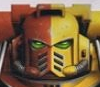
Forgefather Posted August 15, 2013 Author Share Posted August 15, 2013 http://imageshack.us/scaled/medium/21/r8pc.jpg An example of Spot Colours. Looking at the Colour Circle, the complementary colour for red is green. Using this simple technique I applied green sparingly on the two gems on this Captain. And indeed, when asked for their opinion, most people will tell you that the thing they noticed best is the two green (emerald?) gems. Apart from the obvious "He's missing his head/arm!". But that's not important. http://imageshack.us/scaled/medium/713/vmt1.jpg An example here is this... well, very bare Minotaur marine. I used Warplock Bronze for the armour and metal on the weapon, Khorne Red on the Bolter, and Leadbelcher on the rest of the weapon. This was all washed with Nuln Oil. All of it. http://imageshack.us/scaled/medium/208/y48q.jpg Now the same model has been given red lenses. Khorne Red, Mephiston Red, a little dot of Troll Slayer Orange, and washed with Carroburg Crimson. http://imageshack.us/scaled/medium/196/9wjm.jpg Here, the Marine's red lenses have been repainted with Warpstone Glow, Warboss Green, and Moot Green. The reason this looks so good is again, the complementary colours. The problem with the rank and file modes is that spot colours don't really work -- there's just not enough detail to work spot colours into. Of course, rank and file don't really need spot colours. On the other hand, lenses are a good place to work with spot colours; people are naturally draw to the head or face, so might as well use the complementary colours. http://imageshack.us/scaled/medium/89/4trk.jpg The model, quickly highlighted with Sycorax Bronze. Pretty finished for a rank and file (keeping in mind it's 4:18 and I'm focusing on Ray Donovan). Anyway, as you can see the green adds a nice touch compared to the red (and the bronze, which has a red feel to it, too. I just realized the red on the Purity Seal could be used as a spot colour too, but it would probably work better on green models (Llike Dark Angels, Salamanders, Sons of Medusa, etc). That's it for now. Hope it's useful to some of you -- and comments welcome as always. Link to comment Share on other sites More sharing options...
elohimalpha Posted August 26, 2013 Share Posted August 26, 2013 Nice guide! And the green lenses really do pop on that Minotaur - nice job! +++Edit+++ And crap, I just tried it out in the Painter - green lenses look way better than my blue ones. To the paints! Link to comment Share on other sites More sharing options...
Chaeron Posted August 26, 2013 Share Posted August 26, 2013 Really interesting - thank you! Lovely to see a step-by-step guide! Link to comment Share on other sites More sharing options...

Recommended Posts
Archived
This topic is now archived and is closed to further replies.