Sete Posted September 17, 2014 Share Posted September 17, 2014 You know what bothers me? Sentinels of Terra first paragraph. Why did I even picked up that heresy? spedley13 1 Back to top Link to comment Share on other sites More sharing options...
Acebaur Posted September 21, 2014 Share Posted September 21, 2014 Please tell me I'm not the only one who gets disappointed when people don't use this. http://img2.wikia.nocookie.net/__cb20110921051542/warhammer40k/images/thumb/4/49/Black_Templars_Insignia.jpg/250px-Black_Templars_Insignia.jpg I mean, cool art, but I HIGHLY doubt that was supposed to be a chaplain. Yeah, I prefer that layout as well, but I don't mind art that deviates from it, especially if it is only minor like the above. I generally use that layout but I've made some modifications because there is no display for Marshals, Castellans or Techmarines. So I've adopted the Chaplain one to instead be "Command" and all the command positions in my crusade bear the white on black. Link to comment Share on other sites More sharing options...
Marshal_Roujakis Posted September 22, 2014 Share Posted September 22, 2014 I usually go Sword Brethren but with Gold as the trim or the standard Initiates with Gold for trim as well... Castellans have the Sword Brethren Color with Gold trim and Marshals have the Initiate color with gold trim. This is just to remind them of their ancestry from the IF. Techmarines have a layout as well, if you look at the 4th ed Techmarine then you'll see Black Cross, White Pads and Silver/Metal Trim. Link to comment Share on other sites More sharing options...
spedley13 Posted September 22, 2014 Share Posted September 22, 2014 (edited) I usually go Sword Brethren but with Gold as the trim or the standard Initiates with Gold for trim as well... Castellans have the Sword Brethren Color with Gold trim and Marshals have the Initiate color with gold trim. This is just to remind them of their ancestry from the IF.I never thought to use the Sword Brethren w/ gold... I don't mind if people have fun with the shoulder pads as long as they are kept at least halfway looking like they should, or if they have one 'correct' shoulder. What bugs me the most is when people put regular initiate shoulders on terminators. I'll see an amazingly painted bunch of hammernators, and then i see the black on white cross, and it ruins the model for me. @Acebaur like this? (right shoulder) http://www.40kings.de/wp-content/uploads/2013/07/Black_Templar_Marshall_by_slaine69.jpg Edited September 24, 2014 by Brother Tyler Hot-linked image turned into a link. Link to comment Share on other sites More sharing options...
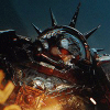
Kastor Krieg Posted September 22, 2014 Author Share Posted September 22, 2014 http://33.media.tumblr.com/64775ecb60c951bac92a6378eb69ed42/tumblr_nbouxkSzfE1sjel1co1_1280.jpg SCOTT_FRANCIS, Trignama, greggles and 5 others 8 Back to top Link to comment Share on other sites More sharing options...
Acebaur Posted September 22, 2014 Share Posted September 22, 2014 @Spedley: Yep, that's it. I like the look of it, it's different and looks great, but still stays within the old codex's set of color choices. I recently tried it out on one of my sternguard who has the command squad champion's shoulder pad(it's the one that looks layered) because it had no border to paint red I thought it would cool. It turned out great so I'm definitely going to keep doing it for command models Link to comment Share on other sites More sharing options...
Sincollector Posted September 22, 2014 Share Posted September 22, 2014 It's funny. I'm the opposite of you guys. I've always found rigid adherence to the shoulder pad scheme to be very "Codex-like" and ignored it. I thought of it as a failure of designer imagination in the previous codex. T14, Metic and Kastor Krieg 3 Back to top Link to comment Share on other sites More sharing options...
Marshal Mattias Posted September 22, 2014 Share Posted September 22, 2014 I follow the initiates/neophyte/chaplain bit, then basically every sergeant/veteran is the sword-brother red-on-black (including squad leaders - my crusade is rebuilding and the majority of my sword brethren are dispersed amongst the troops). Termies are due a re-paint and I haven't decided on them yet. HQs are varied, mixing colours and heraldry as befits their artificer/relic armour history. I'm not a fan of the red trim on white pads for assault etc, I think mine will stay black and white, save for their squad leader. Honda 1 Back to top Link to comment Share on other sites More sharing options...
Kastor Krieg Posted September 27, 2014 Author Share Posted September 27, 2014 Again, not a Templar, but a proud son of Dorn. http://i.imgur.com/cgTP6Ag.jpg Machine God, Marshal_Roujakis, Metic and 6 others 9 Back to top Link to comment Share on other sites More sharing options...
FortesMastery Posted September 27, 2014 Share Posted September 27, 2014 I'd say it counts, after all he brought two melee weapons. Kontakt, Metic and Kastor Krieg 3 Back to top Link to comment Share on other sites More sharing options...
Firepower Posted September 28, 2014 Share Posted September 28, 2014 (edited) http://33.media.tumblr.com/64775ecb60c951bac92a6378eb69ed42/tumblr_nbouxkSzfE1sjel1co1_1280.jpg Never been a fan of this guy (even though he's the Chaos at the Gates emblem). There's a lot of clumsy photoshopping. The chains are (mostly or all) 2d images that he just bent around to look 3d, which really hurts the brain if you look to close at them (the wrist! the wriiiist!). Same for the cross on his shoulder's purity seal. It almost looks like he took someone else's art and slapped on some Templar decorations. It's an art thread and I hadn't laid down a proper critique yet. Someone had to get it. Feel kinda bad that the artist isn't actually present to rebut though. Hm. Oh well, my points stand! Defy my art criticism at your own peril, puny mortals! ....I'm having a strange day. Edited September 28, 2014 by Firepower Mandolore511 and Dark Scipio 2 Back to top Link to comment Share on other sites More sharing options...
Sete Posted October 1, 2014 Share Posted October 1, 2014 http://i.imgur.com/MY8Euu7.jpg Interesting... it actually uses 3D models from Space marine, with the Templar dlc skin specifically Like the shoulder pads... maybe i will make my next templars pads like that. Link to comment Share on other sites More sharing options...
Marshal_Roujakis Posted October 2, 2014 Share Posted October 2, 2014 This is the full piece for the front cover of the book ETERNAL CRUSADER by Nachomolina from DeviantArt please give him/her feedback and support and thank her for another piece that goes in our Templar gallery http://i1151.photobucket.com/albums/o622/Marshal_Roujakis/newMarshal2_zpse33d6d08.jpg Notice all the personal heraldry or Crusade Badges found in the stained glass window behind the High Marshal. And also the fact that not a single Space Marine in this picture cares about the explosions happening outside :p Metic, The_Chaplain, Sete and 9 others 12 Back to top Link to comment Share on other sites More sharing options...
Firepower Posted October 2, 2014 Share Posted October 2, 2014 Now that is awesome. Never seen that one before. Link to comment Share on other sites More sharing options...
The_Chaplain Posted October 2, 2014 Share Posted October 2, 2014 That is a pretty spectacular cover. Don't look at her deviantart page if you are on a work computer though, quite a bit of NSFW stuff in her gallery. Link to comment Share on other sites More sharing options...
FortesMastery Posted October 3, 2014 Share Posted October 3, 2014 I like that we're still one of the chapters that grows facial hair, after all how else are we to bring glory to Dorn's Mustache? Link to comment Share on other sites More sharing options...
Brother Mord Posted October 4, 2014 Share Posted October 4, 2014 (edited) Please tell me I'm not the only one who gets disappointed when people don't use this. http://img2.wikia.nocookie.net/__cb20110921051542/warhammer40k/images/thumb/4/49/Black_Templars_Insignia.jpg/250px-Black_Templars_Insignia.jpg I mean, cool art, but I HIGHLY doubt that was supposed to be a chaplain. Hey remember some of us old timers painted our army when Codex Armageddon came out. Back in my day there was no red trim for assault squads. And Terminators had White Crosses. We were Black and White with no Squad markings AND WE LIKED IT THAT WAY (young wippersnapper ) Not going to repaint my army just because a new codex comes out. Edit for seriousness I use white crosses and white helmets for command personnel (marshals, chaplains, Sword Brethren and command squad members). I started this based on the terminators having white helmets and crosses originally. As mentioned before this was sort of the scheme during the Codex Armaggedon codex when I first started my templar army. Never liked the red trim on assault guys. There is some old artwork which shows a guy or two with a red templar cross on each shoulder pad. I mix a few on those, on one pad, to show some type of honor a particular guy may have won. Mix them up between basic guys and sword brethren, don't use it too much. http://3.bp.blogspot.com/-8mng5M0VxzA/T3JmWx1lssI/AAAAAAAAB74/K91_5-w9Zs4/s400/warhammer_40000_3rd_edition.jpg Edited October 18, 2014 by Brother Mord Marshal_Roujakis, spedley13, Brother Jobu and 2 others 5 Back to top Link to comment Share on other sites More sharing options...
Brother Talon Posted October 4, 2014 Share Posted October 4, 2014 http://33.media.tumblr.com/64775ecb60c951bac92a6378eb69ed42/tumblr_nbouxkSzfE1sjel1co1_1280.jpg Never been a fan of this guy (even though he's the Chaos at the Gates emblem). There's a lot of clumsy photoshopping. The chains are (mostly or all) 2d images that he just bent around to look 3d, which really hurts the brain if you look to close at them (the wrist! the wriiiist!). Same for the cross on his shoulder's purity seal. It almost looks like he took someone else's art and slapped on some Templar decorations. It's an art thread and I hadn't laid down a proper critique yet. Someone had to get it. Feel kinda bad that the artist isn't actually present to rebut though. Hm. Oh well, my points stand! Defy my art criticism at your own peril, puny mortals! ....I'm having a strange day. Not to mention the sword looks absolutely ridiuclous. A Necron would die laughing first, before getting into close combat with that. The blade simply isn't long enough to give true merit to the relic that is the Black Sword... that and let's face it. You gotta be real weak to have to use two hands to field a blade that can barely justify as a longsword. Make it a one hander and give him a bolter shield. Argh! Drives me bonkers looking at the sword alone, much less all of the other warped details. Link to comment Share on other sites More sharing options...
Bung Posted October 4, 2014 Share Posted October 4, 2014 Posted for the laughs. Brother Talon, Kastor Krieg, FortesMastery and 1 other 4 Back to top Link to comment Share on other sites More sharing options...
Kastor Krieg Posted October 4, 2014 Author Share Posted October 4, 2014 Blue hat? Librarians.+ BURN THE WITCH + Link to comment Share on other sites More sharing options...
Honda Posted October 4, 2014 Share Posted October 4, 2014 Never been a fan of this guy (even though he's the Chaos at the Gates emblem). There's a lot of clumsy photoshopping. The chains are (mostly or all) 2d images that he just bent around to look 3d, which really hurts the brain if you look to close at them (the wrist! the wriiiist!). Same for the cross on his shoulder's purity seal. It almost looks like he took someone else's art and slapped on some Templar decorations.It's an art thread and I hadn't laid down a proper critique yet. Someone had to get it. Feel kinda bad that the artist isn't actually present to rebut though. Hm. Oh well, my points stand! Defy my art criticism at your own peril, puny mortals!....I'm having a strange day. Not to mention the sword looks absolutely ridiuclous. A Necron would die laughing first, before getting into close combat with that. The blade simply isn't long enough to give true merit to the relic that is the Black Sword... that and let's face it.You gotta be real weak to have to use two hands to field a blade that can barely justify as a longsword. Make it a one hander and give him a bolter shield. Argh! Drives me bonkers looking at the sword alone, much less all of the other warped details. Yeah, the swords off. I don't really care. I dig him. He says to me, "It's all I have and it may not look like much, but I am taking you out". Link to comment Share on other sites More sharing options...
SCOTT_FRANCIS Posted October 18, 2014 Share Posted October 18, 2014 Don't know if this has been shown before, but I love this guys helmet. Zynk Kaladin 1 Back to top Link to comment Share on other sites More sharing options...
Firepower Posted October 18, 2014 Share Posted October 18, 2014 Not to toot my own vox, but... Marshal_Roujakis, AndrewChristlieb, Acebaur and 6 others 9 Back to top Link to comment Share on other sites More sharing options...
Firepower Posted October 19, 2014 Share Posted October 19, 2014 (edited) Just found this, and I love it: http://25.media.tumblr.com/tumblr_lzujlhulJJ1qm20eho1_500.jpg This too. It looks like it's from the batch of Templar concept art they showed in the preview White Dwarf, but I'm not sure it's the same artist. http://i943.photobucket.com/albums/ad272/Skrakar/1230374988193.jpg Edited October 19, 2014 by Firepower Beerjerker 1 Back to top Link to comment Share on other sites More sharing options...
Acebaur Posted October 19, 2014 Share Posted October 19, 2014 They are both very cool. Though I dislike that Helbrecht is wielding a maul instead of the Sword of the High Marshals Link to comment Share on other sites More sharing options...

Recommended Posts
Create an account or sign in to comment
You need to be a member in order to leave a comment
Create an account
Sign up for a new account in our community. It's easy!
Register a new accountSign in
Already have an account? Sign in here.
Sign In Now