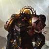
Marshal Reinhard Posted April 17, 2019 Share Posted April 17, 2019 Honestly im not sure it comes across as a powerfield with the detailing lacking the effect. maybe hade you painted the whole thing blue it might have come across as such? I like the fellow regardless, however. Link to comment Share on other sites More sharing options...
Brother Carpenter Posted April 17, 2019 Share Posted April 17, 2019 I like the shield. Gives it a bit more colour. Your reds are also somewhat muted. The shield now really pops Link to comment Share on other sites More sharing options...
Brother Christopher Posted April 17, 2019 Share Posted April 17, 2019 On a critical note: the power field effect could probably be better executed, especially the lightings. You had an interesting idea, but since this is the first time you tried it, there's room for improvement. The power field effect on your power weapons looks great, by the way. With that out of the way, I really like what you're going for - as falcongek said, it adds colour and a kind of 'vibrancy' to the model. If I were you, I'd extend the effect to the edges too, probably going for lighter tones on the very edges. Link to comment Share on other sites More sharing options...
Bjorn Firewalker Posted April 17, 2019 Share Posted April 17, 2019 The Crusader looks good. I like the "charging into battle" pose, though his sword arm should either be raised high so he's ready to slash, or drawn back (with the sword held horizontally) so he's ready to thrust. Link to comment Share on other sites More sharing options...
Marshal Vespasian Posted April 18, 2019 Share Posted April 18, 2019 I like the blue but it feels more like a heraldic choice than a power field. Check out cattatafish on yt. He did a great thunderhammer Video, that I found on here (I am sorry I forgot which crusade all Credit to the marshal in question). He also has one on shields. Link to comment Share on other sites More sharing options...
Ciler Posted April 18, 2019 Author Share Posted April 18, 2019 I like the blue but it feels more like a heraldic choice than a power field. Check out cattatafish on yt. He did a great thunderhammer Video, that I found on here (I am sorry I forgot which crusade all Credit to the marshal in question). He also has one on shields. That's his tutorial I tried to use, guess I should watch it again... Link to comment Share on other sites More sharing options...
Marshal Vespasian Posted April 18, 2019 Share Posted April 18, 2019 In that case just try it again, first time trying a thing will always fail and he looks great as is. I feel like the main problem for me is with the lightning you want to go through two lighter shades of blue until you go white, which is not trivial when wanting to produce clean and crisp lightning. Really nice flowing paint and a very sharp tippe brush are needed. But then again looking at the Rest of your work you propably dont need me to Tell you that because you can do it anyhow. To sum up: keep at it, it looks good Link to comment Share on other sites More sharing options...
Ciler Posted April 18, 2019 Author Share Posted April 18, 2019 Oh yeah, don't worry about it Link to comment Share on other sites More sharing options...
Marshal Mattias Posted April 18, 2019 Share Posted April 18, 2019 Eh, I like it. It's better than I could have managed. Of course you have a high and crisp standard to hold it to, so I understand the criticism, but to me it is an obvious representation of the power field, and looks good beyond "tabletop" and right up close. Link to comment Share on other sites More sharing options...

Recommended Posts
Archived
This topic is now archived and is closed to further replies.