Mechanist Posted November 27, 2018 Share Posted November 27, 2018 Uuuggghhh... I'm not loving how the painting is going. It's too early for me to think that it's genuinly bad... But the base colours are taking forever to get down and I can't tell if it's going to look any good. I'm definitely out of my comfort zone. While building it I was happy to post endless updates with pictures, but I'm finding it a struggle to motivate myself to take WIP pointing shots of it because I can't tell if it just looks terrible and I'm ruining it. Still trying to plod on reguardless in the hope that my fears and frustrations are unwarranted... And well, it's not going to paint itself. I totally get that. If you can break it down gently into sub-assemblies then you'll find it much less daunting to work on one bit at a time. Otherwise you could paint it in quarters or by material (so paint all the metalwork 100% then the armour, then flesh etc) Break the task down though and don't try to do it all in one if you can, that way you also get to see finished results and can be sure your happy with the outcome and capture anything you don't like in a small area as opposed to the whole model. Pearson73 1 Back to top Link to comment Share on other sites More sharing options...
DuskRaider Posted November 27, 2018 Share Posted November 27, 2018 ^ this. This is why I assemble as little as possible on my Knights, it makes painting more manageable. I'd also remove it from the base if at all possible. Link to comment Share on other sites More sharing options...
KrautScientist Posted November 29, 2018 Share Posted November 29, 2018 The finished Knight is nothing short of spectacular -- I agree with DuskRaider, I would never ever give something like this away. Although it says a lot about you that you are prepared to do just that! Huge kudos for the generosity! Can I please be your friend, too? ;) Seriously, though: Absolutely stellar work! Really looking forward to seeing the painted model! Link to comment Share on other sites More sharing options...
Augustus b'Raass Posted November 29, 2018 Share Posted November 29, 2018 Sub-assemblies Sub-assemblies Sub-assemblies It's the three most important things when painting a Knight. ;) :tu: Quixus and Trixie 2 Back to top Link to comment Share on other sites More sharing options...
rednekkboss Posted November 30, 2018 Share Posted November 30, 2018 Fabulous looking knight. I love, love LOVE the Khorny feet treads!! Very dynamic pose! Bravo! Between you and Augustus, some sort of knight will end up on my desk sooner than later. You two are a bad influence. Link to comment Share on other sites More sharing options...
Khornestar Posted November 30, 2018 Share Posted November 30, 2018 (edited) Wow, dude. Honestly, I’m not typically a fan of the “running robot” pose as it seems totally wrong and out of place given how the things are built, like they should fall over because it would be impossible to support weight on a single leg bent at such an extreme angle, However, you didn’t just repose him, you reBUILT him. It totally works, because the thing that was once a knight is now a total monster unconstrained by its components/mechanics. Top notch sculpting as well. Awesome work! Edited November 30, 2018 by Juggernut Link to comment Share on other sites More sharing options...
Pandoras Bitz Box Posted December 1, 2018 Author Share Posted December 1, 2018 I have finally got around to a post with photos of the knight with paint on it! It was starting to feel like it was never going to happen, when I did start I felt like it was looking aweful like I had forgotten how to paint... but not being able to see the finished product in my mind and only have a single thin coat f the basic colours really wasnt doing me any favours. Anyway! here is some progress, I'm more than happy to change the scheme within reason. I obviously havent finished, I still have to add shade in areas, I havent done any highlights, made the gold look brass, or heraldry... bla bla bla... Please, any ideas to improve it, now is the time! Please be honest with your feedback as you have been, I'm a big boy and I can take it. Generally I feel like its going pretty well! Ok, I've been away for a few days sooooo it looks like there's some catching up... @Duskraider Ok, here is some colour on the guy, let me know what what you think. yeah there's a lot of details but I have been trying to consciously keep it quite simple and I've been following the Warhammer TV guides to help me do that, like making most of the mechanical parts just boltgun with wash for now rather than trying to individually distinguish each part, which is a problem I have. I'm actually looking forward to parting with it... I cant wait to see his reaction and also get get on with SOME OF MY OWN GOD DAMN MODELS. As for the separate parts, well the conversion didn't really allow for that sort of option but I have kept the arms detachable. This is the first time I have ever painted a model that wasn't fully assembled. @Mechanist Thanks for the advice, as I said to Dusk raider I did only manage to keep the arms detached but I can reach MOST of the model. it gets a bit tricky around the icon which is swinging really close to his leg. I did try to nail a series of stages on one area before moving onto the next and psychologically I feel like im out of the woods and moral isn't and issue anymore @Krautscientist That is an incredibly nice thing of you to say so, and I take great comfort and encouragement from the fact you think so! It was looking at the Knights of the likes of yourself and Augustus that pushed me in to trying harder, its unlikely I would have taken it this far had I not joined in the bolter WIP community. I do genuinely enjoy doing things like this for my friends... I made a looted carnifex as well as a personalised "colonial Marine" style 40k mini for Krakendoom cool, and the recipient of this knight has previously received a Stormblade from me for Christmas which I also made Khornate... although by comparison it was a very weak job. I basically hung som skulls from chains under sponsons, cut off the imperial eagles and added a couple of khorne/chaos symbols. I just think that a completely unique and nice looking mini is about as cool a present as I could get someone I care about who is into this hobby... and of course we can be friends, it would make me following your every digital action across multiple platforms WAY less creepy. @Augustus b'Raass Well my 3 importent things are the left arm, right arm... and the rest of the horribly complicated and completely fixed knight! @Rednekkboss I'm a big fan of your work, so if I'm helping to push YOU harder then I must be doing something right! I'm looking forward to trying to sculpt something tzeentchian and totally mental after seeing your own awesome nurgle efforts. The feet man... people love those god damn feet! I mean dont get me wrong, I love that people love them... but it just seems so funny how many people mention them, they were a total afterthought! Im really happy I bothered, hopefully my friend will get a kick out of them too. @Juggernut I can appreciate what you mean, the bigger they get the less sense the mobility makes... just look at Pacific Rim... a film that disregards physics to such an extent, I try to explain it to people as a comedy. But because of who its for, and how it would be played... I needed this thing to be a cannonball. I didnt know how I was going to do it or if I could, but Im really happy with how it came out. Ideally I think I would have had something on the base that was getting smashed to pieces to demonstrate the force of this things steps... but I just dont have the resources or time to figure that out. I'm happy with how the base helps with the weight though. Yeah it was quite a rebuild... not the most mental effort I have ever made to repose a model but it took some work with all the toes, pistons, one of the knees and both hips needing some changes. The unique set up of the shoulder guards is even as a result of me not being able to swing the rear arm up high enough for how I wanted it to look... the shoulder was just in the way! so I had to move it to allow for the sprint. It is also a lot easier to suspend disbelief knowing that the machine has been corrupted by powers that alter reality too. I really appreciate your kind words, knowing that you have an appropriately critical eye for details like that! thanks. Wow... thanks everyone for your advice and your really generous feedback. Hopefully I can do the model justice now with the paint job. with any luck my brothers and sisters on bolter will keep me on track if my efforts stray from the right track. Thanks again everyone! KrautScientist, Subtle Discord, rednekkboss and 2 others 5 Back to top Link to comment Share on other sites More sharing options...
Augustus b'Raass Posted December 1, 2018 Share Posted December 1, 2018 Looks good to me so far - and I think this is the only viable colour scheme for this Knight. Sorry to hear subassemblies are no longer an option - but you seem to be doing well :D Pandoras Bitz Box 1 Back to top Link to comment Share on other sites More sharing options...
KrautScientist Posted December 1, 2018 Share Posted December 1, 2018 Red, brass and silver seems like the obvious way to go here, so I think you are moving in the right direction ;) Seriously, though, I think this war will be won through the details: There are several areas on the model that I think deserve special attention and the right kind of detail work: The pilot needs to stand out, with the right amount of attention given to the the skin tone, the scars, the inflamed areas where his implants emerge from his skull. The Knight's actual head and it's wonderfully grotesque neck is another area you need to really nail: Make sure to highlight the bony face enough. Think about how icky you want the cable-neck to be -- maybe some thinned-down Blood for the Blood God would loke nice in the recessed areas?! Just my first round of ideas -- hope this helps! :) Pandoras Bitz Box 1 Back to top Link to comment Share on other sites More sharing options...
Mechanist Posted December 1, 2018 Share Posted December 1, 2018 Looking good so far, psychologically I feel like im out of the woods Glad to hear it. My Khornate Knight totally stalled in part because there is still tonnes left to do on the sculpting and it's just a bit to daunting without a realy vision for the next stages. So I totally get how you felt and pleased your over it and giving us such great pics. Pandoras Bitz Box 1 Back to top Link to comment Share on other sites More sharing options...
Pandoras Bitz Box Posted December 2, 2018 Author Share Posted December 2, 2018 (edited) @Augustus b'Raass Well don't say it like that, I'll be too afraid to make any adjustments to it! I'm glad you think its going the right direction though.. although I may have some slightly radical potential plans for the colour scheme to come, more on that shortly. As for the sub-assemblies, its actually not too bad, just a bit tricky where the symbol is near the leg. This is the first model I've ever done sub assemblies for before painting it. I always liked to fully assemble the model and figured, if I could draw light of sight a part of the model, the brush could also get there. Since assembling Cawl... I'm re-evalating my tactics. @Krautscientist I'm a little worried about how much you guys are into the current colours because I do want to do a little bit more too it... maybe... anyway. Thanks so much for these suggestions, if this is the first and there's more to come I wholeheartedly welcome it. Yeah I do want to try and do a decent job of the skin, I've always wanted to improve my skin painting but didn't realise my first proper effort would not only be a gift for someone else but an entire upper body. Cool idea using Blood for the Blood God on the pipes, i wanted a way to break them up a bit, I tried adding a blue wash hear and there but it didn't really help. I was also thinking of using Blood for the Blood God maybe leaking out of the cracks in the armour... I could have it travelling upwards and sideways in places a bit like the drips on a windshield as you drive quickly... but it would be on red armour, which wont read all that great, thoughts on that? I might have some additional colour on there but I'm not sure yet. @Mechanist Are you finished working on that project for a bit, having a breather while you work on something else or is it still on your workbench. I'd love to have a look and brainstorm if your having some trouble getting the creative juices flowing. I must have missed it, I see you have a link to your thread in your signature so I'll have a look after I've finished this post. So I dont have any more pics of it painted up yet but I wanted to get some feedback first before I did. One of the things i've been thinking about is that while Red is all well and good... it might be nice to break up the armour a bit (and not in the literal sense that I already have). As a knight he would have a house, which I have already chosen for its aggressive culture and symbol, House Aerthegn. The symbol is simple and bold Black and Red, which seems ideal for Khorne, but the where am I putting this symbol? the red would just get lost in the red backgroundld... unless the background was a different colour or I changed the colours of the star. Bear with me on this... My friend plays and all Khorne army, but also likes to personalise his armies. He originally started painting up these minis red, but then while exploring possible ways to customise his scheme I suggested he could add a throwback to the original colours, like white on the shin and blue on the shoulder or something. To save him self some effort he took my suggestion literally and did just that, white left shin, blue right shoulder. I could incorporate this design onto the knight, which would break up the sea of red a bit, but leave it as the dominant colour. So the question is, what do you think? shall I add the colours, should they be block filling the amour plate, or should I use the colour to add a shape such as bars or shevron to that area. If I do use the colours should I put the symbol of house Aerthegn on top or find another place to put it? most of the plates have cracks in now, would it look too busy with the colours or symbol? adding one and/or the other might help draw attention way from the slightly messy way the greenstuff meets the armour, such a flat colour really highlights all of marks and imperfections. I would very much appreciate your feed back on this as it would be a rather big change and if I do it I will take my time to do it right, not time I want to waste if everyone thinks it will look terrible. Thanks guys oh also, after considering carefully what Duskraider and Krautscientist said about not being able to give this thing away I got thinking... he hasnt seen it yet, so I could just whip something else up and give him that instead, then this one will be a christmas present to me! I'm not going to have time while I work on my new awesome khornate Knight to base and paint this new one so he can do that himself... Edited December 7, 2018 by Pandoras Bitz Box Link to comment Share on other sites More sharing options...
DuskRaider Posted December 2, 2018 Share Posted December 2, 2018 Ahh yes, House Ærthegn. They were Khornate before being Khornate was cool AND better Vikings than the Space Wolves. Great choice. The paint is looking promising. Make sure to go on Google and look up images of their heraldry, it's actually really nice. Link to comment Share on other sites More sharing options...
Thousand Eyes Posted December 5, 2018 Share Posted December 5, 2018 I think you may need to add some brighter colours to help the model pop a bit. There is great conversion work in there and I would hate to see it lost. Perhaps have all the skulls glow with an inner light and the pilot to match? Link to comment Share on other sites More sharing options...
Pandoras Bitz Box Posted December 6, 2018 Author Share Posted December 6, 2018 I went for it. Just block colours for now, no highlighting or shading to get an idea. If I keep it then I'm thinking of putting the House Emblem on the blue shoulder and maybe making a pattern of white and either black or red (chevron's or checkered or something) What do you guys think before I proceed... Yey, or neigh? @duskraider I don't really know anything about the knights houses but after some brief research, they did seem the way to go, and that bold 8 pointed star just seems very appropriate. Do you think I should be going full on Heraldry? I was Oly planning on MAYBE doing some and even then only on the shin and shoulder. The cracks in the armour take up most of the model and I'm not sure if it would just look messy to have complex imagery behind the cracks? @Thousand Eyes Well... I'm trying out the extra colours. Let me know what you think. I'll leave the glowing skulls for this one for a couple of reasons. To me that seems more hau ting and arcane, so I'll save that for more MY type stuff... The second reason is... "An inner light"? There's like a million skulls! XD Thousand Eyes 1 Back to top Link to comment Share on other sites More sharing options...
DuskRaider Posted December 6, 2018 Share Posted December 6, 2018 Personally I would go full heraldry but that's just me and how I do mine. It's been 10,000 years, they may have completely abandoned any form of heraldry at this point. I would point out that Ærthegn is actually predominantly red with black chevrons and silver trim but again, after 10,000 years anything can happen. Look at Auggy's Atrax. Here's an example of the House at the time of the Heresy: Link to comment Share on other sites More sharing options...
Augustus b'Raass Posted December 6, 2018 Share Posted December 6, 2018 That's a bold move indeed. I like it. So its a Yea for me. I would suggest though, in order to better balance the contrasting white and blue against the base red, to either move the blue to the right pauldron or the white from the left shin to somewhere on the right side (either the tilt shield or the axe head, as the right shin plate is invisible from the front). Otherwise I fear that you'll end up with a very lopsided colour scheme. Link to comment Share on other sites More sharing options...
Mechanist Posted December 6, 2018 Share Posted December 6, 2018 Augustus has it right, I would be tempted to get some white on the blue and the shield as well. My aim would be to have a triangle of white around the head, this would help frame the focus point that the head should be instead of drawing the eye away. Link to comment Share on other sites More sharing options...
Pandoras Bitz Box Posted December 7, 2018 Author Share Posted December 7, 2018 Although I feel like I'm leaving the grim dark feel of the red behind bit, I'm persevering with the Heraldry route on the principle that if he isn't keen on the colourscheme, it will be very easy to paint Khorne Red over it all... than I tell him I thought about doing this and he thinks "oh that would have been a good idea" so this is what I have come up with so far. What does everyone think? I did do a sort of black on white/white on black mirror image on the left shin, which was like the shoulder skull on its side but it just clashed with the split in the armour. It seems a bit bright as just white though, so I might paint like a crossed axe motif or something in black... or maybe even in the red, its dark enough to provide on contrast. Another area I'm not sure about is the missiles... it seems like a weird thing to be stuck on but I just cant decide what colour to do them. I have the metal behind them and I thought it would look a bit rubbish if it was all just boltgun metal. I might have a crack at getting some detail on the pilot today, I've been putting that off a bit... I feel under pressure to perform since Kraut brought up how important it would be to perfectly execute the pilot to a photo realistic standard. I haven't chosen his eye colour or star sign yet either. Genuinely though... Skin is something I've never been happy with and now I have to just get it right, no time like the present though. @Duskraider I took on your advice and I am having a crack at the Heraldry and i've added some black to it and I think there will be more black again. @Augustus b'Raass Well it was your knights that encouraged me to consider the Heraldry and colour scheme at all, so I do value your input when it comes to layout. I really like your knights and Krauts, but they do have a very different colour Aesthetic, both well executed but but his has that more 'No nonsense' Khorne read which I think I was naturally gravitating towards, but I felt like this knight just needed something to break it up a little bit more, unsure if I was pushing it too far. The lopsided nature of the colour scheme is simply the way it is on his other models, I see your point so I did add something to the right shoulder that included some white. It is a Knight after all and as Duskraider said... its been a long time for this Knight to be hanging around, who knows what has changed. I feel like as long as I keep some of the primary qualities of his army (red/brass/skulls) then the knight can have a bit of a different look to it. @Mechanist I see your point about the head and the focal point, there isnt really that much around the head to focus on it, although there is that plate just above it and the remains of the original Knight helmet so I'll have a bit of a think. if you have any suggestions just shoot. even if I dont want to follow them specifically, anything anyone says could spark inspiration in my head. robofish7591 1 Back to top Link to comment Share on other sites More sharing options...
Augustus b'Raass Posted December 7, 2018 Share Posted December 7, 2018 Hi PBB, that's a very nice addition. Aout my 'lopsided' comment - I have and had no qualms about the Knight fitting your friend's army - I meant that the sceme on the Kniht itself would make it look a bit 'off balance'. You've done very well putting though the white icon on the right pauldron - that strongly balances the white in left lower leg! :tu: Visually, you would now make a very strong impression if there would be something in the same tone of blue on the right, lower side of the Knight. Perhaps even a spare and damaged Rhino door plate or something. It would draw the viewer's eye more towards the centre of the miniature, where its face is. As it is now, the ye is drawn away from the face towards the colours because there is little balance in the scheme. I hope this feedback is something you can use - if not, totally go for your own instincts - it's just my two cents! :D :tu: Link to comment Share on other sites More sharing options...
Mechanist Posted December 7, 2018 Share Posted December 7, 2018 (edited) The freehand is really nice, I'd love to see some table level pictures or 'golden angle' pictures to get an Idea of the balance of details. Edited December 7, 2018 by Mechanist Link to comment Share on other sites More sharing options...
Pandoras Bitz Box Posted December 7, 2018 Author Share Posted December 7, 2018 (edited) Thanks guys, this is really helpful Tonight I'll try to do some more work on it then take some more photos with a plain background from a few different angles. I'll also look for some vehicular debris that I can add to the base. Im having a little trouble trying to mangage the balence in my head of the value of the colours... Like, the symbol on the shoulder I like, but off Camera they don't pop very much against the blue because it's all quite dark... But at the same time I feel like I need to bring down the white as it's so intense. I was thinking that about maybe intensifying the emblem and then using weathering to cut them back again. So they are easier to differentiate from he other colours, but not so distracting. I'm I crazy, does that many any sense? Is this achievable for someone of my level? Edited December 7, 2018 by Pandoras Bitz Box Link to comment Share on other sites More sharing options...
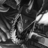
Pandoras Bitz Box Posted December 9, 2018 Author Share Posted December 9, 2018 (edited) I haven't had a good opportunity to sort out some new photos of the knight as a whole yet, I've been doing some shading and also working on some shading, highlights a ND also finally had a crack at the Pilot, so I welcome Kraut's candor, braced very much like to pilot to take the brutally honest critique. Edited December 9, 2018 by Pandoras Bitz Box Quixus, Subtle Discord, Augustus b'Raass and 2 others 5 Back to top Link to comment Share on other sites More sharing options...
Mechanist Posted December 9, 2018 Share Posted December 9, 2018 Wow that really brings him to life, that face. Nice work there. Link to comment Share on other sites More sharing options...
Krakendoomcool Posted December 9, 2018 Share Posted December 9, 2018 The pilot is looking great. The highlighting on the muscles really works a treat. He is standing out nicely and is a good focus point. It will be tough to get the Knights head to stand out because of the colour and position but you can highlight and shade metallic so go for that. Highlighting the designs will definitely pick them out if you think it’s all a bit dark. Link to comment Share on other sites More sharing options...
KrautScientist Posted December 9, 2018 Share Posted December 9, 2018 The pilot is looking absolutely fantastic, mate! Brilliant job! I would only suggest maybe using a very controlled application of some Carroburg Crimson around the areas where the cables connect to his body, to make the skin there look inflamed and irritated. As for the rest of the Knight, I've been debating with myself over whether or not to post this, because I don't want to demotivate you, but here goes: I have to admit I am not a fan of the changes you've made to the actual Knight's colour scheme... - Disclaimer: Now, you may want to take this with a grain of salt, as I recognise that I just love Khornate daemon engines in red and bronze, so I acknowledge my bias - That being said, I have two main problems with the scheme you have right now: One, it actually looks as though made it up as you went along (which, in all fairness, I think you did, right?). But if you want the poper "heraldic" feeling on a Knight, it probably makes sense to think long and hard about the overall look you want to achieve, then work from there instead of making adjustments on the fly. I think Augustus' comments on the dangers of a "lopsided" colour scheme actually touch upon the same issue. Right now, unfortunately, the colour scheme looks a bit too much like you just tried things without a proper plan, at least to me. Does that make sense? Problem two, the bright white: It doesn't work, in my opinion, because it draws attention to where you don't want it to go: On a machine like this, you want people to look at the head - and in this case, possibly, the pilot. Not the right shoulder and left shin guard. So what solution do I have to offer? Hmm, tricky. I am tempted to say that red/blue/white/black doesn't really work. I think if this were my model I would either go back to a relatively "clean" Khornate look (as in, red and brass) and maybe include some markings in black. Or come up with a completely different colour scheme that is less of a compromise -- see Augustus' recent Knight colour scheme for an example of an approach that feels both chaotic, but also very heraldic. Again, this is just my two cents. And I apologise for sound overly critical -- then again, this is definitely a standout piece, and you definitely want to make it the best it can possibly be, and that involves a couple of tough nuts to crack ;) Augustus b'Raass 1 Back to top Link to comment Share on other sites More sharing options...

Recommended Posts
Create an account or sign in to comment
You need to be a member in order to leave a comment
Create an account
Sign up for a new account in our community. It's easy!
Register a new accountSign in
Already have an account? Sign in here.
Sign In Now