Dwango Posted February 3, 2021 Share Posted February 3, 2021 Loving the sister there! I think your suggestion of adding more yellow to the bolter and eye lenses will work well. Looking forward to seeing more. Link to comment https://bolterandchainsword.com/topic/361395-majkhels-not-blood-angels-thingies-another-assassin/page/2/#findComment-5663600 Share on other sites More sharing options...
Majkhel Posted February 4, 2021 Author Share Posted February 4, 2021 (edited) Loving the sister there! I think your suggestion of adding more yellow to the bolter and eye lenses will work well. Looking forward to seeing more. Thanks Dwango! I think I've settled on the scheme. Manged to add another 2 girls and I like the look of them in the group as well. Still WIPs and some things require addressing. For the Bolters, I've added a transition from a little warmer shade (added a touch of brown beside black for the shade) ad strengthened the yellow in the upper parts with additional stronger edge highlight. I also made some scratches shade for even stronger contrast. And because my chosen yellow - VMC Lemon Yellow) is either a bit old, or otherwise really hard to work with - kinda pasty and does not mix well with water. Just got to be careful not to make them overly busy. I like their overall cool colour - it works well with the blue-green plate. Now I need a new, single colour as base for the armour. For those three, I've been mixing the shade using blue, light blue and green (plus black and white for shades and highlights respectively), but I don't imagine doing it for a whole army not to mention vehicles. I'm eyeing the Vallejo Turquoise or Jade Green paints as potential solutions. Unfortunately my local shops do not have them for the moment, so I'll have to order and then see them on a model to be sure. Internet images are obviously only of a general reference value. Cheers! EDIT: a side note - Sisters are hard to paint on their bases once assembled. All the folds, leg armour intermingled together... I painted them on pins or sticks before putting them on bases and that worked. Arms were also painted separately and then attached to the torsos. Edited February 4, 2021 by Majkhel Dwango and BadgersinHills 2 Back to top Link to comment https://bolterandchainsword.com/topic/361395-majkhels-not-blood-angels-thingies-another-assassin/page/2/#findComment-5663759 Share on other sites More sharing options...
Majkhel Posted July 30, 2021 Author Share Posted July 30, 2021 (edited) I see some time has passed without updates here. I managed to complete a whopping 5-girl squad: Still haven't found the single colour to substitute the mix I did on their plates. And I did tried at least 6 blue-green-turquoise paints. In the end I figured I either start eating through the acquired Sister's backlog or will spend eternity searching fr the perfect colour match On the plus side, I've settled on the flowers on their bases and violet-pink details.Cheers! Edited July 30, 2021 by Majkhel Dwango, Raziel-TX, Mithrilforge and 2 others 5 Back to top Link to comment https://bolterandchainsword.com/topic/361395-majkhels-not-blood-angels-thingies-another-assassin/page/2/#findComment-5725068 Share on other sites More sharing options...
Bjorn Firewalker Posted July 30, 2021 Share Posted July 30, 2021 Beautiful work on the Sisters. Link to comment https://bolterandchainsword.com/topic/361395-majkhels-not-blood-angels-thingies-another-assassin/page/2/#findComment-5725077 Share on other sites More sharing options...
Majkhel Posted July 31, 2021 Author Share Posted July 31, 2021 Thanks Bjorn! Cheers :D Link to comment https://bolterandchainsword.com/topic/361395-majkhels-not-blood-angels-thingies-another-assassin/page/2/#findComment-5725331 Share on other sites More sharing options...
Brother Christopher Posted August 3, 2021 Share Posted August 3, 2021 The squad of Sisters looks amazing, the colours you picked (especially the colour of the armour and the yellow bolters) are pretty dope and are a great match. I'm sure that the photos don't do the miniatures justice. It's a bummer you didn't get a simple solution / ready colour equivalent, though. But you're right to move on with painting instead of fixating more on the colour match. Majkhel 1 Back to top Link to comment https://bolterandchainsword.com/topic/361395-majkhels-not-blood-angels-thingies-another-assassin/page/2/#findComment-5726047 Share on other sites More sharing options...
Majkhel Posted August 3, 2021 Author Share Posted August 3, 2021 The squad of Sisters looks amazing, the colours you picked (especially the colour of the armour and the yellow bolters) are pretty dope and are a great match. I'm sure that the photos don't do the miniatures justice. It's a bummer you didn't get a simple solution / ready colour equivalent, though. But you're right to move on with painting instead of fixating more on the colour match. Thank you kindly Cristopher! The scheme is result of playing with the colour-wheel and colour theory. If you haven't explored this topic yet, try it! It's a fascinating journey :) And yeah, I'm struggling a bit to capture the actual armour colour. It being a mix of blues and greens clearly causes problems for my phone camera. Depending on the light, the colour comes out more green or more blue. Link to comment https://bolterandchainsword.com/topic/361395-majkhels-not-blood-angels-thingies-another-assassin/page/2/#findComment-5726063 Share on other sites More sharing options...
Brother Christopher Posted August 3, 2021 Share Posted August 3, 2021 Yes, I am familiar with the notion and have some vague understanding how it works - I try to use it in photography; however, I never consciously applied it to the hobby - I mostly use random sources of inspiration from old books (including How to Paint Space Marines) or stuff I see online. It's extremely tricky to get the photos right and - I think - it's often not worth the hassle, unless you want to take photos and properly showcase your models, like in the Hall of Honour subsection. For other purposes, such as sharing your progress with the community, whatever your phone/camera produces is fine. By the way, how did you make the flowers? Majkhel 1 Back to top Link to comment https://bolterandchainsword.com/topic/361395-majkhels-not-blood-angels-thingies-another-assassin/page/2/#findComment-5726222 Share on other sites More sharing options...
Majkhel Posted August 3, 2021 Author Share Posted August 3, 2021 Flowers are ready-made. You can buy them as any other tufts. These particular ones are from PaintForge. As far as I know they are made like normal grass-like tufts and then sprinkled with glue and small coloured bits to imitate flowers.I guess you're right with the photos. I should probably just to do my best to make the pictures clear and sharp rather than search for the perfect colour rendition :) Link to comment https://bolterandchainsword.com/topic/361395-majkhels-not-blood-angels-thingies-another-assassin/page/2/#findComment-5726274 Share on other sites More sharing options...
Majkhel Posted February 23, 2022 Author Share Posted February 23, 2022 (edited) Coming back to this almost forgotten thread with a fun addition - this will be a count-as Death Cult Assassin (originally a 28mm Hot&Dangerous series: Azumi) I keep finding that painting something different from time to time is really fun and helps you develop :) As Death Cult Assassins are now in units of 2-5, I will paint a Knosso Prond model to match her at some point in time. Cheers! Edited June 27, 2022 by Majkhel Dr_Ruminahui, Mithrilforge, BadgersinHills and 3 others 6 Back to top Link to comment https://bolterandchainsword.com/topic/361395-majkhels-not-blood-angels-thingies-another-assassin/page/2/#findComment-5799382 Share on other sites More sharing options...
Majkhel Posted May 12, 2022 Author Share Posted May 12, 2022 (edited) Back to he 40k proper - my take on Navigator Espern Locarno from the Blackstone Fortress game: Couple of things I had in mind while painting him: - leave the comfort zone of red color :P - try to reflect the connection between the Navigator and his duties of guiding ships (lots of dark blues and violets to represent space) - try to reflect the wealth of the Navigators without going overboard - NMM practicing... That last one was quite a challenge as due to really small details (fortunately also crisp) on the mini, I limited myself to the rim of the armor and at one point decided to do a NMM gold thread on the cloak I think it came out OK. The lettering on the scroll is mostly done with cut decals from the SoB transfer sheet (one is misplaced, but fortunately it's not that visible outside pictures). Cheers! :) Edited June 27, 2022 by Majkhel Brother Captain Vakarian, Shovellovin, CyderPirate and 8 others 11 Back to top Link to comment https://bolterandchainsword.com/topic/361395-majkhels-not-blood-angels-thingies-another-assassin/page/2/#findComment-5826839 Share on other sites More sharing options...
Raziel-TX Posted May 12, 2022 Share Posted May 12, 2022 Love that mini Godzilla on your death cult stand in! Nicely pulled off. Majkhel 1 Back to top Link to comment https://bolterandchainsword.com/topic/361395-majkhels-not-blood-angels-thingies-another-assassin/page/2/#findComment-5826888 Share on other sites More sharing options...
Majkhel Posted May 12, 2022 Author Share Posted May 12, 2022 Thanks Raziel! It was definitely fun even if it makes the base a little cramped :P Link to comment https://bolterandchainsword.com/topic/361395-majkhels-not-blood-angels-thingies-another-assassin/page/2/#findComment-5826917 Share on other sites More sharing options...
Dr_Ruminahui Posted May 12, 2022 Share Posted May 12, 2022 Your navigator is beautiful - the artwork on the cloak in particular. I think it was a good decision t make the centre of the crest green - nice complimentary colour while still standing out and bringing attention to itself. Very opulent looking. Majkhel 1 Back to top Link to comment https://bolterandchainsword.com/topic/361395-majkhels-not-blood-angels-thingies-another-assassin/page/2/#findComment-5827183 Share on other sites More sharing options...
Majkhel Posted May 13, 2022 Author Share Posted May 13, 2022 Thank you very much for dropping a comment Dr_Ruminahui! I'm really happy that this feel of opulence is being translated :)Cheers! Dr_Ruminahui 1 Back to top Link to comment https://bolterandchainsword.com/topic/361395-majkhels-not-blood-angels-thingies-another-assassin/page/2/#findComment-5827356 Share on other sites More sharing options...
Zebulon Posted May 15, 2022 Share Posted May 15, 2022 Love that mini Godzilla on your death cult stand in! Nicely pulled off. Godzuki! *possibly showing my age* Mithrilforge and Majkhel 1 1 Back to top Link to comment https://bolterandchainsword.com/topic/361395-majkhels-not-blood-angels-thingies-another-assassin/page/2/#findComment-5827964 Share on other sites More sharing options...
Majkhel Posted July 24, 2022 Author Share Posted July 24, 2022 Finished Larsen van der Grauss mini as a tech-priest and ally of the Legio Bolter&Chainsword for the B&C Reforged contest: Spoiler Raziel-TX, Chaos Moomin, andes and 5 others 8 Back to top Link to comment https://bolterandchainsword.com/topic/361395-majkhels-not-blood-angels-thingies-another-assassin/page/2/#findComment-5849310 Share on other sites More sharing options...
Sherrypie Posted July 24, 2022 Share Posted July 24, 2022 Beautiful stuff there. I like the cold, deathly skin tones surrounded by the warmer reds. Majkhel 1 Back to top Link to comment https://bolterandchainsword.com/topic/361395-majkhels-not-blood-angels-thingies-another-assassin/page/2/#findComment-5849378 Share on other sites More sharing options...
Majkhel Posted July 25, 2022 Author Share Posted July 25, 2022 Happy you noticed that It was my first time trying that kind of skin color Link to comment https://bolterandchainsword.com/topic/361395-majkhels-not-blood-angels-thingies-another-assassin/page/2/#findComment-5849460 Share on other sites More sharing options...
Dr_Ruminahui Posted August 4, 2022 Share Posted August 4, 2022 Your paint job is great - what a gloriously silly looking model, though, very 40K. Majkhel 1 Back to top Link to comment https://bolterandchainsword.com/topic/361395-majkhels-not-blood-angels-thingies-another-assassin/page/2/#findComment-5853271 Share on other sites More sharing options...
Majkhel Posted August 4, 2022 Author Share Posted August 4, 2022 5 hours ago, Dr_Ruminahui said: ...what a gloriously silly looking model, though, very 40K. Isn't it? Not what we would expect from a Mechanicum Adept, but then all the goodies are there: coils, cables, bulbs, wires and a little sinister feel. I didn't like the model when it was released but it grew on me with time. And during painting I really warmed up to it. Dr_Ruminahui 1 Back to top Link to comment https://bolterandchainsword.com/topic/361395-majkhels-not-blood-angels-thingies-another-assassin/page/2/#findComment-5853337 Share on other sites More sharing options...
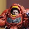
Majkhel Posted August 31, 2022 Author Share Posted August 31, 2022 (edited) Time has come for another count-as Deatch-Cult Assassin so that I can field a unit of them. Spoiler This time it's a Corvus Belli production - one of the new Shinobu Kitsune figures. It has some similarities to the one I painted in February being a lady with a strong Japanese theme. Less 'traditional' and more sci-fi. In my mind this one fits perfectly into the Inquisition setting as presented in fantastic Dan Abnett's Eisenhorn, Ravenor and now Bequin series. A lovely sculpt I was enamored of from first sight. She has that great feel of movement in her pose. Detail is crisp although really tiny in places. Compared to GW sculpts she was a real challenge but a welcome one. A size comparison to a Primaris marine (had to put a Blood Angel here somewhere ). The lady has a slight bump on the base to increase the jump-pose dynamics: Edited August 31, 2022 by Majkhel sockwithaticket, Valkia the Bloody, Mithrilforge and 3 others 6 Back to top Link to comment https://bolterandchainsword.com/topic/361395-majkhels-not-blood-angels-thingies-another-assassin/page/2/#findComment-5862163 Share on other sites More sharing options...
Dr_Ruminahui Posted September 7, 2022 Share Posted September 7, 2022 She's gorgeous - what a great mini and you've given it a beautiful paint job. The white hair is a bit unexpected, though - what were your thoughts for that? Was it to contrast the rich colours on the rest of the model? Majkhel 1 Back to top Link to comment https://bolterandchainsword.com/topic/361395-majkhels-not-blood-angels-thingies-another-assassin/page/2/#findComment-5864833 Share on other sites More sharing options...
sockwithaticket Posted September 18, 2022 Share Posted September 18, 2022 Nice vibrant colours. Cool to go with a very different scheme for a DCA as well as a different model. I like purple and teal, have been toying with combining the two, so it's good to get a look at something which does so. Majkhel 1 Back to top Link to comment https://bolterandchainsword.com/topic/361395-majkhels-not-blood-angels-thingies-another-assassin/page/2/#findComment-5867579 Share on other sites More sharing options...
Majkhel Posted September 19, 2022 Author Share Posted September 19, 2022 (edited) Thanks guys! On 9/8/2022 at 1:28 AM, Dr_Ruminahui said: She's gorgeous - what a great mini and you've given it a beautiful paint job. The white hair is a bit unexpected, though - what were your thoughts for that? Was it to contrast the rich colours on the rest of the model? Sorry I missed your post! That's a good question. It's not a deeply thought-through thing. I had only a rough idea of what I want when I started to work on her, but I defined 2 main concepts beforehand. First was that I wanted to make her a little bit a negative of the previous girl. She had a single big sword instead of 2 smaller ones so it made some sense in that regards. As the feature to fulfil this, I chose the hair to be white as the first girl has it black. The second concept was to use the jade and purple as main colors on the body. When I painted the earlier girl, I introduced the purple very late in the process, but I loved the result. With the new girl I wanted to explore the idea more thoroughly. In retrospect, I have to say I got really drawn into the painting of the body armor and the colors around it. However the hair remained kind of separated in my head from the rest of the mini because it followed a different concept path Looking at it now, I think they are not bad, but they do are a bit bland. If I were to do something about it, I think I could introduce some delicate pink and yellow glazes in certain areas. That would definitely push the overall looks even more towards the cyber-punk area, but would make more sense from the color palette's perspective I think. Thanks for the question! 22 hours ago, sockwithaticket said: Nice vibrant colours. Cool to go with a very different scheme for a DCA as well as a different model. I like purple and teal, have been toying with combining the two, so it's good to get a look at something which does so. Cheers sockwithaticket! Definitely try it, it's a great combination. Very striking. The key I think is to keep one a bit more saturated than the other. Your choice which obviously For extra saturation on the pink/purple, go with magenta and add yellow for extra vibrancy. Adding yellow was a real discovery for me as I struggled with highlighting pink without loosing saturation that normally happens when you add just white. EDIT: By the way, I actually did a little change to the last assassin after a very apt suggestion from my painting group - a minor things in terms of effort, but with a noticeable impact. A slight coloration on the lips (how could I have forgotten? It's actually crucial imo for female models!) and a little blacklining to define separation between armor around the left shoulder. Spoiler Edited September 19, 2022 by Majkhel Dr_Ruminahui 1 Back to top Link to comment https://bolterandchainsword.com/topic/361395-majkhels-not-blood-angels-thingies-another-assassin/page/2/#findComment-5867663 Share on other sites More sharing options...
Recommended Posts
Create an account or sign in to comment
You need to be a member in order to leave a comment
Create an account
Sign up for a new account in our community. It's easy!
Register a new accountSign in
Already have an account? Sign in here.
Sign In Now