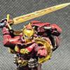
Indefragable Posted March 31, 2020 Share Posted March 31, 2020 (edited) NOTE: Does anyone know how to get Gallery images to stay oriented the correct way? They keep getting inverted; they are correct orientation on my phone, on my computer, etc... but when they are loaded to B&C they are auto-inverted. Rotating the images both within the B&C gallery as well as prior to uploading (so inverting them on my computer) still has them come out inverted. Help. Brothers of Baal, Looking to get your take on which of the following color schemes you think works better. Concept: We all know that balancing "realism" with 40k is always a dicey proposition. I mean, the entire setting relies upon "the warp" as the ultimate hand-waving explanation and the fact that "drive me closer, I want to hit them with my sword!" is an actual viable strategic maneuver. For that reason, my thoughts below might sound a bit odd, but bear with me. I've never liked the idea of Scouts or other infiltration units wearing ridiculous colors likes red (Blood Angels) or yellow (Imperial Fists) and such. Line troops can kind of get away with it--in my own internalization of 40k "logic"--in a flags + pennants sort of way, kind of like feudal Japanese armies of yore. But units that are supposed to sneak up to the enemy would have at least more muted colors if not outright camouflage. This would be regardless of chapter or preferred tactics; camouflage is a tool for infiltration units just as much as chainfists or Terminator suits are for VBSS in SPAAAAAAACE units. That is where my mindset is coming from. Now, this is a hobby and there are certain immutable laws that apply. Like Rule of Cool and the fact that a certain eye candy aspect needs to apply to models. In my opinion, a model that would be "realistically" camouflaged might actually look kind of boring since by its nature, a camouflaged model would have its contours all broken up and it would be hard to pick out which part is which. There is also the ultimate factor of the skill of the hobbyist....and I have neither the skill nor the patience to paint every model in actual camouflage. That leaves me to have a more subtle, muted, and frankly simple overall color scheme with the idea of putting a transfer on the left shoulder to mark out the chapter. I think of how many current day military units have a shiny rank insignia for the barracks and then a black or other color for actual wear in the field. My goal is to paint every single model I have that can infiltrate in the same color scheme. So that's Scouts Incursors Infiltrators Eliminators Phobos Captains Phobos Lieutenants Scout Bikes (they don't infiltrate, but...well....Scouts) ...that will all be painted in the same overall color scheme, of which I have settled on the following 2 color themes: "Midnight" or "Desert." I would ask your opinion as to which you think is better overall*. Please note that these are WIP and many details (like night vision goggles) I have not done yet. So, without further ado, let's play "who wore it better?" Midnight: Hidden Content Desert: Hidden Content Now, after you've had a chance to see both of those in a vacuum, my follow-up question is how you think they would look as part of the whole of the army. BA color palette is essentially Red + Black and Gold (in various proportions). For me, this happens both on the micro scale (on each model in some capacity) as well as on the macro level (the army as a whole comes off as red-black-gold from across the room. How much would a desert scheme "break" that overall theme? The last data point (wait there's more?) to consider is that I also play 30k/HH, and my IX Legion also represents the red/black/gold micro/macro scale as well. In light of that, the Midnight scheme might pay homage to their forebears with the overall theme as well, even if the desert may/not look better in and of itself. IX Legion/30k army color scheme (as a matter of fact, this is the world reveal of my IX Legion painting) : Hidden Content 8th Ed/40k BA colors + Midnight Hidden Content 8th Ed/40k BA colors + Desert Hidden Content So whatdayathink? Thanks -Indy Edited March 31, 2020 by Indefragable Link to comment Share on other sites More sharing options...
Xenith Posted March 31, 2020 Share Posted March 31, 2020 The sand scheme looks better in my opinion. The sandy yellow goes well with the warm reds. I think the grey is just too grey. Maybe if you painted the pads black to break it up a little? I did a similar thing with my relictor-like scheme several years ago. Link to comment Share on other sites More sharing options...
The Unseen Posted March 31, 2020 Share Posted March 31, 2020 I personally would just use a muted dull red. But my planned board is going to be Baalite themed with dark reddish sand, so idk? The desert colors mesh better than the grey, it's just too flat and therefore oddly enough sticks out a lot when next to everything else. Link to comment Share on other sites More sharing options...
Zebulon Posted March 31, 2020 Share Posted March 31, 2020 I vote midnight, but with a darker grey - closer to black. If you go darker, it would have that ninja/Splinter Cell/special forces vibe. The light grey looks too similar to unpainted plastic I think. However, I don’t think the sandy/khaki scheme goes at all with Blood Angels, personally. I’m not seeing what the other guys are seeing in terms of that meshing with Red/Black/Gold. Link to comment Share on other sites More sharing options...
Bjorn Firewalker Posted April 1, 2020 Share Posted April 1, 2020 Your models are well-painted, Indefragable. I like the subtle weathering in the desert models. "Midnight" looks too gray to fit the name, though; may I suggest the name "Concrete" for those models? Link to comment Share on other sites More sharing options...
Hintzy Posted April 1, 2020 Share Posted April 1, 2020 My vote is for black/gray, but add a little red to distinguish them as Blood Angels. I did something similar with the chest aquillas painted red. I do actually regret painting them differently from the rest of my army though. I know red isn't sneaky, but after all is said and done I wish I'd just gone for the classic scheme so they fit in better. I don't regret it enough to repaint them though... Link to comment Share on other sites More sharing options...
Majkhel Posted April 1, 2020 Share Posted April 1, 2020 (edited) While I agree with you that a typical BA-ish army is usually at least a three-coloured army (with SG and DC usually having distinctive colour schemes and on top of that - Sanguinary Priesthhod and Librarians sprinkling in additional spot-colours), my experience is similar to Hintzy's. In my case Eliminators were the unit that due to camo cloaks got marked to follow-up with the 'camouflaged' theme. Mind that I still wanted to add red to them to clearly mark them as Blood Angels and avoid the Raven Guard feel. Eliminators in a Night/Urban camouflage with one knee pad, torso armour and one shoulder pad red. While they came out adequate to my expectations, it all began with the camo cloaks and all decisions were based on their application. And after the dust has settled, I still ended up with them more on the looks-like-BA side, than the camouflage side.And I definitely don't want to create yet another (4th across the army not counting Librarius and SangPriests) colour scheme for the whole 10th Company (scouts+Vanguard) so I will keep this for Eliminators only. As you say - the eye-candy aspect is important, so any chosen camo scheme needs to be additionally stylised and allow for edge highlighting etc. Having said all this, about the schemes you have proposed. Both have the potential to work. Night, because of the 'ninja factor' and will tie better with the DC. But some measures would probably be needed to differentiate them from Raven Guard. Also currently it is just too grey overall. While it definitely works for the camo-feel, it looks worse in a visual aspect than the desert scheme. I'm guessing the harsh white light from the photo-box is not helping to show the difference in tones. Adding some more defined black, might help, but will create problems if the chapter badge is also black. Perhaps making one shoulder pad in a muted red as a base for the chapter badge? If kept muted, it would not stick out too much to destroy the night camo.Additionally, are you cheating a bit with changing their bases to grey as well? You should check them on the final bases, which I think would be desert/sand The desert scheme looks visually better having more contrast between armour plates and clothing. However there is currently nothing that marks them as BA and I'm not sure the chapter badge will do the trick from the table top perspective. You could introduce some muted brownish red to the desert scheme as well. Hope this gives you some food for thought EDIT: good work on the 30k marines! Do show us more! Edited April 1, 2020 by Majkhel Link to comment Share on other sites More sharing options...
Loishy Posted April 1, 2020 Share Posted April 1, 2020 I had a similar idea a few month ago for my scouts and infiltators. I didn't start the peint yet but I had think a lot about this.I think you should follow the theme of your regular marine's base. If it is dessert -> dessert color scheme. if it is Midnight -> Midnight. The most important for me is the coherency with the rest of your army. Link to comment Share on other sites More sharing options...
Indefragable Posted April 7, 2020 Author Share Posted April 7, 2020 (edited) Quick update: "Well there's yer problem!" Some how in the chaos of my painting space I forgot to put the Midnight skulls under Nuln Oil. In the words of a scholar of our day: D'oh! Here is an update on how they look properly shaded. I put in a Death Company Marine as well for comparison to show "my" black and how it all ties together. Note: I can't seem to get the close up of the Nuln'd Scouts to upload; keeps saying file is too big for some reason. I'll repost once I've troubleshot it. Edited April 7, 2020 by Indefragable Link to comment Share on other sites More sharing options...
Majkhel Posted April 8, 2020 Share Posted April 8, 2020 Improved Night scheme with the muted red pauldron works for me :) Indefragable and The Unseen 2 Back to top Link to comment Share on other sites More sharing options...
Hintzy Posted April 8, 2020 Share Posted April 8, 2020 Improved Night scheme with the muted red pauldron works for me :) Seconded Indefragable 1 Back to top Link to comment Share on other sites More sharing options...


Recommended Posts
Create an account or sign in to comment
You need to be a member in order to leave a comment
Create an account
Sign up for a new account in our community. It's easy!
Register a new accountSign in
Already have an account? Sign in here.
Sign In Now