Brother Christopher
-
Posts
2601 -
Joined
-
Last visited
-
Days Won
20
10 Followers


About Brother Christopher

Recent Profile Visitors


Brother Christopher's Achievements
")


-
 Smoke Frog reacted to a post in a topic:
Post your homages
Smoke Frog reacted to a post in a topic:
Post your homages
-
Firedrake Cordova reacted to a post in a topic:
Post your homages
-
Tallarn Commander reacted to a post in a topic:
Post your homages
-
@Smoke Frog That's absolutely amazing. What an idea! What execution! Cool. Sorry, but I'm so impressed that I can't really type anything constructive. Inspiring. Makes me want to attempt a similar thing. Kudos.
-
Brother Christopher reacted to a post in a topic:
Post your homages
-
Brother Christopher reacted to a post in a topic:
New Chaos Models
-
Smoke Frog reacted to a post in a topic:
Post your homages
-
phandaal reacted to a post in a topic:
Your Model of the Year - 2025
-
Spazmolytic reacted to a post in a topic:
Your Model of the Year - 2025
-
 Heraclite reacted to a post in a topic:
Your Model of the Year - 2025
Heraclite reacted to a post in a topic:
Your Model of the Year - 2025
-
Alby the Slayer reacted to a post in a topic:
Your Model of the Year - 2025
-
Dr_Ruminahui reacted to a post in a topic:
Your Model of the Year - 2025
-
Kommisar_K reacted to a post in a topic:
Your Model of the Year - 2025
-
Even though it's not my best-painted model, for me, it has to be my plasticard Thuderhawk that I realised I finished this year. Just for the sake of finalising a project >10 years in the making.
- 35 replies
-
- 17
-
-
-
Brother Christopher's WIP
Images added to a gallery album owned by Brother Christopher in Adeptus Astartes / Legiones Astartes
-
-
 Brother Christopher reacted to a post in a topic:
10th Anniversary Intercessor Squad, new options (Helmets, torsos and more)
Brother Christopher reacted to a post in a topic:
10th Anniversary Intercessor Squad, new options (Helmets, torsos and more)
-
Brother Christopher reacted to a post in a topic:
10th Anniversary Intercessor Squad, new options (Helmets, torsos and more)
-
Brother Christopher reacted to a post in a topic:
10th Anniversary Intercessor Squad, new options (Helmets, torsos and more)
-
Brother Christopher reacted to a post in a topic:
Model of the Year - 2025
-
Brother Christopher reacted to a post in a topic:
=] 12 Months of Hobby 2025 [=
-
=] 12 Months of Hobby 2025 [=
Brother Christopher replied to Grotsmasha's topic in + WORKS IN PROGRESS +
@HerocideThat's a really cool conversion. I'm loving it. *** I, Brother Christopher, continue the 12 Months of Hobby Challenge, and for the month of December pledge to complete 1 Space Marines Shield Captain by month's end.
- 766 replies
-
- 10
-
-
-

-
The Pounder’s 40K and HH project log
Brother Christopher replied to The Pounder's topic in + WORKS IN PROGRESS +
That's a good choice. And I'm glad you like him. I find all Primaris Jump Infantry a bit awkward but the 'old' Primaris Jump Captain is by far the best of the bunch (the new one, with a storm shield, is okayish too). I'm curious where you'll land with him. EDIT: Are you planning to modify the mini or you'll go with the vanilla kit this time? -
Progress Log: Alpha Legion Warband: "The Last Surprise"
Brother Christopher replied to hd3's topic in + WORKS IN PROGRESS +
Man, I really shouldn't visit your thread. Every time I see your marines, I kind of want to get some metallic marines painted. I can't get over how striking your paint scheme is. The details on the helmets are small, indeed. But I think you won't have too much trouble getting them right. Remember that you can always cover some of the mistakes up with a glaze or wash (and get some additional shading done, too). -
The 'Crusader Host' 2.0 (and a tyranid)
Brother Christopher replied to hd3's topic in + WORKS IN PROGRESS +
Good progress and a fun way of keeping things fun. I like the BA but I think I'll like the heretic model even more. Are you planning to paint the lightning on the armour, too? This is a great feeling, isn't it? A thing that no one really notices but you know you got it right. It's really cool that something as small as this can bring a lot of satisfaction. -
The Pounder’s 40K and HH project log
Brother Christopher replied to The Pounder's topic in + WORKS IN PROGRESS +
That's the worst, isn't it? But being in the hobby for a long time means that this will happen. I let the opposite happen: I let the hobby get in the way of life and now have to suffer the consequences. Good luck with whatever life brings, both hobby- and otherwise. The model looks great. I like the edge highlights, the (what appears to be) metallic finish of the shoulder pads' trim and the general feel. The choice of bits is also great: While I'm not familiar with the character, he looks like an UM commander should. -
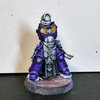
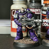
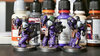
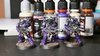
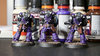
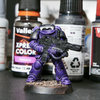
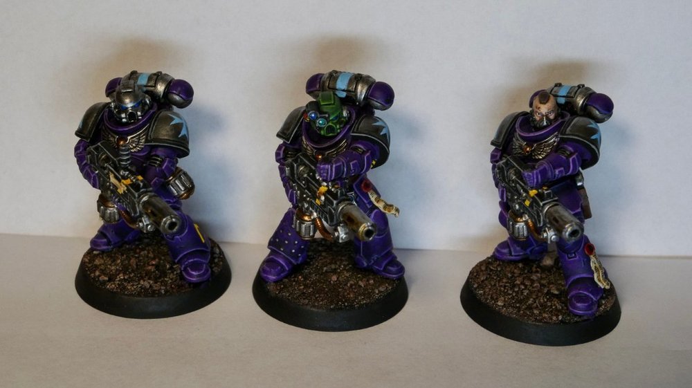
Here are the three finished melta marines. This time without any grass or tufts yet. At the moment it's quite cold (sub-zero temperatures) and since I'm doing all my varnishing and priming outside, I feel I don't want to risk it and will wait for better weather. EDIT: As always, with my doubts and indecisiveness, I'm not 100% sure about the silver livery for my support squads. I think it looks okay but can't stop wondering whether I should go for a non-metallic colour for the pads, backpack and helmets. With your positive feedback, I know I haven't made a mistake. But I'll make up my mind about whether to use this scheme for future fire support squads later.


- 335 replies
-
- 12
-
-
-
-
=] 12 Months of Hobby 2025 [=
Brother Christopher replied to Grotsmasha's topic in + WORKS IN PROGRESS +
November's vow complete:- 766 replies
-
- 10
-
-
-
Brother Christopher reacted to a post in a topic:
W.A.Rorie's Grey Knight 1st Brotherhood
-
Brother Christopher reacted to a post in a topic:
W.A.Rorie's Grey Knight 1st Brotherhood
-
The armour's looking fine. But what stands out is the gold. Roughly speaking, how long do you reckon it took you to get it to this point?
-
Primarisized Grey Knights - Test Model
Brother Christopher replied to Grotsmasha's topic in + GREY KNIGHTS +
Looks good. You're ready for GW primarising Grey Knights soon! What's your decision regarding the weapons' colours? Are you sticking to a single colour or per-rank variants? I can only imagine. This kind of work is the worst bit about conversions and the primary reason I've almost given up on doing any. You can always try the 21st route and get some 3D-printed ones or use a 2000s solution and do green stuff casts of the bits you need. I think it's a better and faster solution for the kind of work you need. GS also is quite pliable so easier to clean up. -
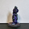
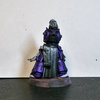
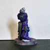
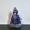
I think you;re right. Even if it's not for the direct application of the technique/approach, trying this out gave me a better understanding of what I want from the hobby. I turns out that I was quite right in the first place: that I kind of want more of the familiar and don't really want to get outside my comfort zone. Especially since the results don't seem to justify the additional time spent. *** The last thing I tried yesterday was NMM. And I now know that it's something I don't wan to do. It turned out that it's an even larger effort than I expected. Given my non-hobby obligations, I'm not certain that at this stage of my life I don't want to make this drastic jump in the approach to paining miniatures. I think it's a bit sad, really, but I'd estimate that it's only around 10-15% sad (mostly because I see this giving up as a failure of sorts). But overall, I'm sure it's for the better. Regardless, I'm sorry for oversharing! I'm sorry to hear that, but I'm assuming that you're on the mend and better now! Best wishes! Thanks for watching. As always, I'm thrilled you liked the updates and hope not to disappoint with more of them.
-
Brother Christopher reacted to a post in a topic:
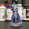
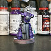
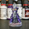
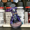
Brother Christopher's Purple Marines Project
-
Once again, thank you for your feedback. It's noted and I'll try to do something about the backpack the next time I get around to painting him. Having said that, I think this style of painting isn't for me, at least at this moment in my life. It's a bit... unrewarding, given how slow progress is, particularly since I'm learning things on the go. I think I would've finished 1-2 models in that time. I don't mean to complain: painting this is an interesting proces but given my state of mind, I think I'd need a dopamine rush that finishing a model gives. But that's also good: I've tried something new and learnt something new. I also have new ideas that I'm quite eager to try out. But most importantly, I think I'm this close to breaking the mental barrier of caring about an uniform look of marines in this project. I think I should - and will - try different approaches and perhaps do sub-projects within this one. However, all other attempts will be to reach a satisfying tabletop+ standard that I'm used to.