Bjorn Firewalker Posted January 10, 2020 Share Posted January 10, 2020 It looks good- easy for you to paint, easy identifiable, and easily distinguished from others, as all symbols should be. Brother Lunkhead 1 Back to top Link to comment Share on other sites More sharing options...
gripschi Posted January 10, 2020 Share Posted January 10, 2020 I Like it. The First Looks the best. A good Chapter Symbol. But i would suggest that you alternate Second and Third beside tze Clours. Maybe a slight Alteration from the Symbols. To better differ them. Brother Lunkhead 1 Back to top Link to comment Share on other sites More sharing options...
Grey Hunter Ydalir Posted January 10, 2020 Share Posted January 10, 2020 Two things, first I'd say is that it looks like the Jedi Order symbol. That's not a criticism or a bad thing in any way unless you personally dislike the similarity, it's just an observation. Secondly, the colours are all remarkably similar to each other, and the general armour colours. This means everything is going to blend and get lost. What I would say to remedy this if you wished it would be to make the inverted omega and the sword completely different colours. A deep(dark) purple omega and/or a golden/silver sword. I suppose what I'm proposing is a 'pop' colour (make it pop!), which sounds funny when you're talking about a chapter symbol rather than an overall scheme, but I think it's relevant here. Brother Lunkhead 1 Back to top Link to comment Share on other sites More sharing options...
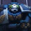
Brother Lunkhead Posted January 11, 2020 Author Share Posted January 11, 2020 (edited) Thanks for the feedback. I'm posting the heraldry again here to reference as I go trough each of your comments. 1 2 3 Before I get started, I'll do a little self critique. I don't know why I didn't see it before I posted, but quite obviously (obvious to me based on the standard Mainz design on which this sword is based on) the blade is too short by exactly one-fifth above the guard. So the first thing I need to do is redraw and correct that error. The colors are a bit off too. I used what markers and colored pencils I had on hand which were approximately correct. The blue and gray inks are both a bit too dark in all three. When I do the final renditions the blue will be more faded and the gray will be slightly brighter and more metalic. The backgrounds on 2 and 3 are penciled in lighter to give better contrast (more on contrast later). It looks good- easy for you to paint, easy identifiable, and easily distinguished from others, as all symbols should be. Thanks Brother Bjorn. I was going for a design is simple and harkens back to the chapter's Ultramarines origins, but with enough difference to easily distinguish it from other primogenitor chapters. Well, Bjorn likes it, so what more do I need ....... So, thanks for your comments everyone...….. I Like it. The First Looks the best. A good Chapter Symbol.But i would suggest that you alternate Second and Third beside tze Clours.Maybe a slight Alteration from the Symbols. To better differ them. Thanks gripschi. Good observations and comments and I'll address your very valid critique below. Two things, first I'd say is that it looks like the Jedi Order symbol. That's not a criticism or a bad thing in any way unless you personally dislike the similarity, it's just an observation. Secondly, the colours are all remarkably similar to each other, and the general armour colours. This means everything is going to blend and get lost. What I would say to remedy this if you wished it would be to make the inverted omega and the sword completely different colours. A deep(dark) purple omega and/or a golden/silver sword. I suppose what I'm proposing is a 'pop' colour (make it pop!), which sounds funny when you're talking about a chapter symbol rather than an overall scheme, but I think it's relevant here. Well met Brother Grey, my old sparring partner …..first I'd say is that it looks like the Jedi Order symbol. I sat down last night with the two heraldries and a pint glass of Jack Daniels and thought about this..... …… Sooooo….. after finishing my pint of old No.7 I came to the conclusion that you were absolutely right An ink blot of the Jedi Order symbol and a jelly filled Agemo look similar. But, I don't think that will be a problem. I don't mind and the Chapter Master doesn't notice it,..... and no one is going to tell him, as he is no longer a Star Wars fan. Anakin Skywalker...…..Darth Vader...…..PUNK - Last words heard uttered by Chapter Master Bellerophon on the subject of Star Wars after seeing Episode 3: Revenge of the Sith But i would suggest that you alternate Second and Third beside tze Clours. Secondly, the colours are all remarkably similar to each other, and the general armour colours. This means everything is going to blend and get lost. Good points both of you. In my design of the Pauldron heraldry I intentionally went with a mono colored symbol over the secondary colored pauldron. The lower half of the pauldron will be colored in the company livery of the individual Marine and I want to limit the palate to three colors to keep the combination from being too busy. I'm keeping all of the colors subdued to give the combination more of a combat uniform feel. The only thing I want popping are daemons, heretics, xenos, and traitor marines. Although I might make the Chapter Master's symbol and that of the command staff and guards white over a bisected blue and steel field. Thanks again for your comments all..... they were most helpful. Edited January 11, 2020 by Brother Lunkhead Grey Hunter Ydalir 1 Back to top Link to comment Share on other sites More sharing options...
Grey Hunter Ydalir Posted January 11, 2020 Share Posted January 11, 2020 (edited) Well met Brother Grey, my old sparring partner Good points both of you. In my design of the Pauldron heraldry I intentionally went with a mono colored symbol over the secondary colored pauldron. The lower half of the pauldron will be colored in the company livery of the individual Marine and I want to limit the palate to three colors to keep the combination from being too busy. I'm keeping all of the colors subdued to give the combination more of a combat uniform feel. The only thing I want popping are daemons, heretics, xenos, and traitor marines. Although I might make the Chapter Master's symbol and that of the command staff and guards white over a bisected blue and steel field. Thanks again for your comments all..... they were most helpful. I had a witty repartee, which all could laugh to, comedy gold in fact and self deprecating to boot about my willingness to fight and argue. Then I refreshed the page with a miss-hit key combo. I obviously didn't recite the right litanies to the machine spirit, nor hit the right runes in sequence. Or maybe I haven't poured on enough sacred oils.... Moving swiftly on. While I understand what you mean about having a uniform colour and it being somewhat subdued, but I'd raise the point that Astartes (disregard the Poe Boys) are made to be seen. It's part of their modus operandi. You take medieval knights, the heavily armoured nigh unkillable, highly skilled walking man-tanks that they were and transpose their role into 'modern' warfare. Your heraldry and declaring yourself to the enemy is in many ways part of the psychology of war, it works against the enemy to know that they're facing a Space Marine. The same thing goes for ancient combat in many ways. The Praetorians had a reputation of their own, if mostly internally. The Spartans would be a good example of this. By all means you don't have to do this, it's just an observation. You can have something that's easily recognizable without it blending in too much. I would say, keep company and squad markings out of the chapter symbol. It'll over-complicate the design and make it a bit of a nightmare if you ever go to paint up a significant number of these boys. When designing symbols for military or national designations, there are a few rules. Simple, strong and uniform across all flags, patches and stencils. It's easy to get carried away, however I believe unit/company/squad markings should be kept seperate. The 'codex' idea of having companies be delineated by trim colour on pauldron is actually a fairly good idea. In the same vein as medieval knights or ancient strategos I think your commanders should have personal/rank heraldry, even if it's a purple sash or purple banner/pauldron inset colour. I'm just picking purple out of a hat here because it's a 'royal' colour and these guys are called Praetorian. Out of curiosity, given how we're talking about heraldry, symbol and colour, what marks out your veterans and is it similar to your commanders? Funny thing with that Jedi Order symbol is that if you redraw yours and lengthen the blade... it'll be even more similar. Edited January 11, 2020 by Grey Hunter Ydalir Brother Lunkhead 1 Back to top Link to comment Share on other sites More sharing options...
Brother Lunkhead Posted January 12, 2020 Author Share Posted January 12, 2020 Grey Hunter Ydalir Posted Yesterday, 02:01 PM I had a witty repartee, which all could laugh to, comedy gold in fact and self deprecating to boot about my willingness to fight and argue. Then I refreshed the page with a miss-hit key combo. I obviously didn't recite the right litanies to the machine spirit, nor hit the right runes in sequence. Or maybe I haven't poured on enough sacred oils.... Very frustrating...… I would have enjoyed that Can't tell you how many posts I've lost to warp gremlins. While I understand what you mean about having a uniform colour and it being somewhat subdued, but I'd raise the point that Astartes (disregard the Poe Boys) are made to be seen. It's part of their modus operandi. You take medieval knights, the heavily armoured nigh unkillable, highly skilled walking man-tanks that they were and transpose their role into 'modern' warfare. Your heraldry and declaring yourself to the enemy is in many ways part of the psychology of war, it works against the enemy to know that they're facing a Space Marine. The same thing goes for ancient combat in many ways. The Praetorians had a reputation of their own, if mostly internally. The Spartans would be a good example of this. There's much truth in that. But my feeling is that once a battle barge or strike cruiser translates in system and enters the target zone, the enemy knows who's come knocking. If they somehow miss that part, once the Praetorian Sword makes planetfall they'll know for sure the kind of trouble they are in for. I think that's more than enough psychology You've probably seen the short film Astartes. While I'd settled on my chapter's livery long before the first installment of this fine film came out, looking at the very simple design of these guys just reinforced my decision. While the Praetorian Sword has more former Praetorians (Invictarus Suzerains) than its brother chapters (Ursan Lords, Liberation Knights, Hammers of Ultramar, Hospitalers Militant), the name honors the original Retribution Fleet (Fleet Praetor) and is not meant to imply an elite status among Astartes. If anyone assumes that, the Chapter's position is "that's their problem". The Chapter's personality is a mix of stoicism and battle fury. The livery and heraldry are designed as such to reflect that. I would say, keep company and squad markings out of the chapter symbol. It'll over-complicate the design and make it a bit of a nightmare if you ever go to paint up a significant number of these boys. When designing symbols for military or national designations, there are a few rules. Simple, strong and uniform across all flags, patches and stencils. I'm in complete agreement with you on that. ….In the same vein as medieval knights or ancient strategos I think your commanders should have personal/rank heraldry, even if it's a purple sash or purple banner/pauldron inset colour. I'm just picking purple out of a hat here because it's a 'royal' colour..... Commanders will stand out with more personalized livery for sure. Out of curiosity, given how we're talking about heraldry, symbol and colour, what marks out your veterans and is it similar to your commanders? Veterans across the chapter will be denoted by a simple white stripe across their helmets (similar to a lieutenant). Commander ranks will be a variant laurel on the helmet and a command symbol embedded in the chapter heraldry on their left pauldron. Funny thing with that Jedi Order symbol is that if you redraw yours and lengthen the blade... it'll be even more similar. Looks like I'll need more Jack Daniels, Brother Grey Hunter Ydalir 1 Back to top Link to comment Share on other sites More sharing options...
Grey Hunter Ydalir Posted January 13, 2020 Share Posted January 13, 2020 All fair points. I'm happy with that and I mostly agree with your views. I just like presenting competing opinions and viewpoints and this is just one good example of why. It's all looking pretty good so far. I guess I'll just wait for more! Brother Lunkhead 1 Back to top Link to comment Share on other sites More sharing options...
Brother Lunkhead Posted January 14, 2020 Author Share Posted January 14, 2020 All fair points. I'm happy with that and I mostly agree with your views. I just like presenting competing opinions and viewpoints and this is just one good example of why. It's all looking pretty good so far. I guess I'll just wait for more! Thanks for all of your comments and observations, especially the "competing" ones Your observations and those of many other Fraters have allowed me to look at my work with a more critical eye and hopefully make it better in the long run. My goal now is to largely finish up (it will of course never truly be finished) this IA by the end of March, then move on to planning and outlining my next two chapters for LASC 2020 I'll be trickling a few things out over the next few weeks (finished heraldry design, maybe a few minis, maybe even some text too) then things will be quiet for a while as I prepare for the big push to finish. Thanks again everyone for taking the time to look at and comment on the Praetorian Sword. I truly appreciate it. Grey Hunter Ydalir 1 Back to top Link to comment Share on other sites More sharing options...
Brother Lunkhead Posted January 25, 2020 Author Share Posted January 25, 2020 (edited) I'm calling on my long dormant memory of Latin studies and working on some Latinized titles and phrases for the Praetorian Sword. I'm mostly looking for stuff that looks and sounds interesting, so there's a mixture of proper and dog Latin, so disregard the grammar…… That's my story and I'm sticking to it Comments and suggestions are always welcome and appreciated Chapter Motto: Imperator Enim Primarch In Spe (For Emperor, For Primarch, For the Dream) Battle Cry: Et Ignem Irae (Fury and Fire) CHAPTER COMMAND Chapter Master: Dominus Dux Militum / Informal: Primus Dominus Master of the Marches: Magister Consilio Bellum Master of Relics: Magister Armorum Antiquis Master of Victuals: Magister Militiae Ciberia Master of the Watch: Magister Vigilantiam Master of the Arsenal: Magister Armamemtarium Master of the Rites: Magister Sacrorum Master of Signals: Magister Signum Fleet: Naves Maris Stella Master of the Fleet: Domini Maris Stella Librarius: no change Chief Librarian: Dominus Quod Librarius Codicier: no change Epistolary: no change Lexicanum: no change Acolytum: no change Reclusium: No Change Master of Sanctity: Dominus Sanctorum Senior Chaplain: Summus Sacerdos Chaplain: Sacerdos Apothecarion: no change Master of the Apothecary: Dominus Medicus Apothecary: Medicus Armourium: no change Master of the Forge: Dominus Ignis Senior Techmarine: Fabri Ferrarii Techmarine: Discipulus Fabri More to come...... Edited January 25, 2020 by Brother Lunkhead Bjorn Firewalker and Grey Hunter Ydalir 2 Back to top Link to comment Share on other sites More sharing options...

Recommended Posts
Create an account or sign in to comment
You need to be a member in order to leave a comment
Create an account
Sign up for a new account in our community. It's easy!
Register a new accountSign in
Already have an account? Sign in here.
Sign In Now